Thursday, 26 January 2017

Wednesday, 25 January 2017
Research and planning – Advert: Drafts of adverts
After identifying key elements that make a successful advert
we have started to put up a design of our advert and began to look at the
different ways we can make it successful. The function of an advert is
important because it can help to promote the product across different media
platforms thus provide synergy. Therefore, it is important to make it elegant,
appropriate for the genre and appealing for the audience in order to secure a
profit/ success. It is also important that an advert share common conventions
with the digipak or the video in order to allow the audience to familiarize and
recognize the product.
DRAFT 1

- For our first draft, we have decided to include a medium shot of the main character who is facing the camera. However, the artist’s face is half cropped which shows consistency from our digipak to the advert. We also included bright colours as well as a disintegration effect to make the advert look different from the album and to appeal to a wider audience through the unique representation of our main artist. We intentionally choose these colours because the dull green connotes depression, lack of interest and mental exhaustion of the main artist. The disintegration effect also provokes the same feeling as well as making the viewers assuming how drugs and addiction can affect someone. We believe that these factors are conventional because the artist looks vulnerable meaning that she is not promoting her persona instead promoting her values and ideologies as well as music.
- We intended to use high-key lighting to make the artist look exposed and defenceless. This will make the viewers feel sympathy for her as well as wanting to find out more due to the colours and disintegration effect used. We believe that is conventional because it creates a sense of mysteriousness that will appeal to a wider audience in order to get success.
- We believe that the typography we chose fits the Alternative/Jazz genre, as it is simple, edgy, bold and unique. The typography used on the title and the date are bolder, in black on a white background to make it stand out. Whereas the artist name is a signature to make the audience feel closer to the artist. We believe that it is conventional because it is expected for the typography to reflect the mood and the artist persona through the colours and shapes.
- The overall layout is neat and consistent as the information is spaced out revolving the main image. This is conventional as it draws in the audience to the advert. The layout is also simple as it only includes simple information.
- The information we included on the advert involve the artist name, the title of the album and the release date as well as the company details. We have only included relevant information on the advert to make the audience aware of the details, however, we have prevented over complicating the advert to avoid confusion or misunderstanding.
- The language we used is simple and formal, as we want the audience to be able to relate to the album and the artist and understand that it is aimed at a certain type of audience, which is conventional, as the information should reflect the audience and their social class.
- We did not include sub-images; however, we added the logo of the company promoting the album, which is a necessity.
- The advert would appeal to subcultures, which supports Hebdige’s theory. This is because it has an unusual effect. The artist is gradually disappearing which does not place her at the centre of attention but intrigues the audience as to why is that, which can lure audiences. In mainstream music, the artists are often the centre of attention and try to ‘lure’ audiences and sell their music through looks. However, by making the effect the main look of our digipak we are more likely to appeal to subcultures who reject the mainstream values (hegemony) because our product does not follow the mainstream culture.
Audience Feedback
Strengths:
- The image manipulation is impressive and very eye catchy.
- Good use of font. It also compliments the digipak and the video.
- The date is easy to read and stands out.
- The company details are clear and makes the product look professional.
- The format is correct and fits its purpose.
Weaknesses:
- There is a lot of blank space which should be filled, otherwise it will look boring and make the consumer uninterested.
- The manipulation does not match the smoke effects, which were used within the digipak and the video. This makes it inconsistent.
- The use of color does not really match the other products. Consider adding some black and white or fading out the color.
Further Action Plan:
- We will fill up the empty space by adding some ‘Key Singles’ and digital platforms which will enable consumers to download our product, which is an example of synergy.
- We will manipulate the image again and instead of using the disintegration effect we will use the smoke effect in order to make consistent products.
- We will use less colour in order to match the digipak.
DRAFT 2

Analyse the use of Conventions:
- After receiving feedback and criticism from different viewers, we made changes in our advert. We kept the image and colours; however, we changed the effect of the picture. We decided to add the smoke effect used in the album, as the advert was lacking consistency. We believe that by using the same effect on the advert it will look more appealing and originating from the same concept and values the digipak holds. This is conventional as it makes the artist look mysterious and unknown to the audience. The colourful smoke represents life, which evaporated from the artist due to her addiction issues and other problems. This allows people to feel sympathy and maybe a sense of familiarity.
- The colour we added was black and light grey. We believe that these colours will complement each other as well as showing consistency through the advert and the digipak. The smoke effect represents the depression and loneliness the main artist is experiencing. She is so depressed that the colours are fading away from her, which also connotes her addiction to cigarettes and drugs. We believe that it is conventional because the viewers will be able to relate to the experience the artist is feeling thus causing them to bond.
- We included more information in our advert, such as the artist and album name, the release date, key singles and apps where you can download the music. Not only had we done this to promote and make our artist more popular, but also to encourage the viewer to buy the album.
- The smoke connotes addictions and mental health issues. This makes the artist seem familiar within the audience who could also struggle. This follows Dyer’s theory as Sarsha seems ordinary and extraordinary and has a clear personality and own character.
Audience Feedback
Strengths:
- The smoke effect works well with the whole concept and helps to convey the themes well. It is also consistent with the rest of the products.
- The color scheme is also effective as there is black and white which corresponds with the rest of the production but the colors also add a little mystery.
- The addition of key singles and download information works well and makes the product look professional and industry suited.
Weaknesses:
- There is too much smoke in some parts of the advert and it makes it rather distracting and busy
Further Action Plan:
- We will get rid of some smoke in order to clear the image and help the audience focus, as right now it can be quite distracting.
Conclusion:
Overall, the drafting process allowed us to create a
sophisticated product due to the development process and useful feedback, which
enabled us to progress. The drafting showed us the amount of progress we went
through and allowed to taste how real designers work on products in the
industry and how much they rely on the audience in order to create a successful
and proficient product, which will bring profit and sell well to the intended
target audience. Some of the main changes we have made was the change of the
main effect, which enabled us more consistency throughout our products. We also
made sure we included relevant details about the product and informs the
consumer.
Research and planning – Digipak: Drafts of digipak
After researching into generic conventions of a digipak and
looking at specific indie products, we have come up with a digipak design,
which would fulfill the audiences’ expectation and fit with our overall
campaign. In order to create a successful product our digipak underwent the
drafting process, which allowed us to constantly receive feedback on our work
and improve. We received feedback from the supposed target audience, in order
to meet their expectation and sell well, as well as other media students who
have an accurate idea of what is required for the product. This allowed us to
create a successful product which is fit for purpose.
DRAFT 1

Analysing the use of Conventions:
- We have included the image of our main artist on the cover of the digipak. She is looking away from the camera. The medium close up shows the side of artist’s face, which is conventional as it makes the singer look mysterious and unknown to the audience rather than glamourises her. The image is also professionally edited as it is grey on a white background and a smoke effects is applied on the picture of the artist. This is conventional because the white backgrounds allow the image to stands out and the smoke effect representing the abuse of substances as well, as how these drugs consume her, which the audience can relate to. In addition, the manipulation of the image is common among the indie genre because niche artist do not try to sell their image but can be unique. The smoke fits the theme of drugs.
- The title of the album is ‘China White’ which is located on the bottom right corner of the cover, on top of the CD as well as the spine of the album. The one on the album cover is bold and black representing the bad side of artist. Whereas, the one on top on the CD and on the spine is in white with a black background. This represents the good life of the artist and shows consistency of our work. Moreover, the artist name, Sarsha, is placed on the album cover, on the CD and after the quote. The one on the cover is in white with black shadows symbolising the good side of the artist and foreshadowing her depression and substance abuse. The name of our album is less obvious and foreshadows drugs, which relates to all the songs on the album.
- The main colours we used in our album are black, white and light grey. We believe that these colours complement each other as well as conventional for the Alternative/Jazz genre. We also chose these colours because they connote the struggle between the ‘good & evil’ as well as provoking mysteriousness for the audience. The grey smoke also works well with the theme of drugs.
- The mysterious nature is further reinforced through the typography which differs and contrast with the background. The white colour promotes the artist innocence and vulnerability, whereas the black colour representing the lonely and depressed side of the main artist. We believe that the use of typography and colours are conventional because it reflects the mood and the artist persona through the colours and shapes.
- The overall layout is neat and consistent as the information are spaced out revolving the main image. Also the use of the smoke effect will be seen on the outside of the album, whereas the CD and the quote of the main artist will be will be located on the inside of the digipak. This is conventional as it draws in the audience to the digipak and allows some contrast.
- The information we have included in our digipak are the title of the album, the artist name, the company details and the barcode. This is necessary information and legally every product needs to have the manufacturer name and barcode.
- The language we have utilised is simple and formal, as we want the audience to be able to relate to the main artist and the maturity of the issues the artist is surrounded by.
- We did not include sub images, instead we corporate a quote from the main artist to promote her ideologies and persona to the audience who mainly fights with drugs and alcohol on a daily basis as well as people who struggle with other personal issues. We believe that this is conventional because we are not only promoting the main artist as a successful and happy figure but show her problems and difficulties thus allowing the audience to feel familiar with her.
- The digipak would appeal to subcultures, which supports Hebdige’s theory. This is because it has a unique and unusual design, especially with the smoke manipulation. The artist has a distorted face which doesn’t place her at the centre of attention, unlike artist from popular culture. In mainstream music the artists are often the centre of attention and try to ‘lure’ audiences and sell their music through looks. However, by making the smoke the main look of our digipak we are more likely to appeal to subcultures who reject the mainstream values (hegemony) because our product does not follow the mainstream culture.
- According to Dyer the star should be ordinary and extraordinary and should have own character and personality in order to allow the audience to feel familiar and connect to them. Sarsha has a sense of familiarity due to her struggles, which draws in audiences.
Audience Feedback:
What do you like about it?
Front Cover:
- Excellent manipulation of image, especially on the front cover.
- The use of font is appropriate to the genre and consistent throughout the product. It is also easy to read.
- The predominant grey reflects the genre and theme of the product well.
Back Cover:
- Clearly consistent with the front cover
- There is relevant information about the distributors and it includes all necessary information, including the copyright formation.
The Inside:
- The quote helps to make the artist familiar and allows the consumer to connect with her, despite she is an upcoming artist.
- The colours work well alongside the CD.
- There is font consistency.
The CD:
- Has relevant information.
- Compliments the inside.
- The font is consistent.
What do you dislike about it?
Front Cover:
- The image resolution is not as sharp as it could have been.
- It is a bit too bright, I think a darker shade would work more effectively due to the daunting theme of the product.
Back Cover:
- Similarly, to the front cover, the back should be a bit darker.
The Inside:
- The inside looks a bit empty. I would recommend adding a small image to make it look fuller and complete.
- The signature is hard to read and doesn’t look authentic.
- Considering adding some smoke for a more consistent look.
The CD:
- I would add some smoke too in order to show more consistency
Further action plan:
From the feedback we have received we plan to do the
following in order to improve:
Front Cover:
- We will recreate the digipak on Photoshop for a better resolution.
- In Photoshop we will be able to manipulate the contrast and tone of the digipak which will allow us to create a darker image.
Back Cover:
- After transporting.
The Inside:
- The inside looks a bit empty. I would recommend adding a small image to make it look fuller and complete.
- The signature is hard to read.
- Considering adding some smoke for a more consistent look.
The CD:
- I would add some smoke too in order to show more consistency.
DRAFT 2

Analysing the use of Conventions:
After following the feedback and criticism from the viewers,
we made changes to our digipak to meet the audience expectations. We have
included a hand-drawing image of a bottle of wine and a smoking cigarette on
top of the ashtray, which connotes to the addiction the artist is victim of.
The drawing is coloured in white with a black background, which makes the image
stands out as well as connotes to the ‘good vs evil’ theme. We believe that this is conventional and will
meet the audience expectation because it links to one of the hit singles as
well as is consistent throughout the album. We have also digitally added the
smoking effect on the CD as well as on top of the smoking cigarette. This not
only shows regular consistency but also makes it eye catchy and relate to the
theme we chose. Lastly, we have also changed the layout position in order to
fit industry purpose such as for professional printings etc.
Audience Feedback:
Strengths:
- The darker highlights on the front and back cover correspond with the theme of drugs within the album
- The names of the soundtracks are intriguing and show exactly what the album is about which evokes a sense of familiarity for the consumer
- The image in the inside is suits the theme and the overall theme of the product
- Overall the digipak is suited for purpose and has realistic measurements
- The digipak corresponds with the advert and the video
- The little uses of smoke on the CD and the inside work well
- There is not an overload of information which is effective
Weaknesses:
- The inside panel should have the artist’s name on it to show that the quote belongs to her and help to create a bond between the artist and audience.
Conclusion:
Overall the drafting process allowed us to create a
sophisticated product due to the development process and useful feedback which
enabled us to progress. The drafting showed us the amount of progress we went
through and allowed to taste how real designers work on products in the
industry and how much they rely on the audience in order to create a successful
and proficient product which will bring profit and sell well to the intended
target audience. Some of the main changes we have made was to darken the tone
of the digipak and enhance the idea of ‘Good vs Evil’, which plays out in the
artist life. The smoke effect is consistent and continues to feature in our
advert and video, which allows the audience to recognize our work.
Monday, 23 January 2017


Research and planning – Advert: Identifying conventions and analysing existing adverts
Purpose:
- Includes key information such as release dates for the audience to be aware of
- Promotes the album for the artist
- A form of synergy to promote the artist and album
- Reminds the audience of the artist’s existence and the album, especially if they are an artist who is not regularly in the public eye, for example, Michael Buble, who only creates an album every Christmas, therefore the advert is a reminder for the audience.
What are the generic conventions?
- Album title
- Artist name
- Release date
- Key singles
- Where you can buy and stream
- Artist image
- Prental advisory logo if required
Analysing Existing Adverts
Kasabian

- Main Artist: Despite promoting their debut album the band uses a simple image to advertise their music, instead of showing their own faces. This doesn’t allow the audience to familiarise with the band but puts them in apprehension. This shows that the band doesn’t try to glamourize themselves or their image for money but instead focus on their music. The simple main image portrays a male figure with a covered face which further conveys the sense of mystery and intrigues the audience. This is conventional of an indie rock band as they don’t try to sell their music through looks but the actual content of their products.
- Lighting and Colour: The black and white are binary opposites and propose themes of ‘Good VS Evil’ or ‘Light VS Dark’ which could possibly pass a subtle message to the audience about the album or the band. Rock genre is known for controversial or original morals. In addition, black is a common colour associated with rock due to its connotations of evil and darkness. The simple use of colour allows the audience to draw individualistic connotations and possibly feel somewhat familiar with the poster which can intrigue them.
- Typography: The bold and heavy typography compliments the genre of the product. Rock is associated with heavy and loud sounds. The simplicity of the typography compliments the overall image of the product and allows the audience to explore the product and decode the poster for themselves, basing on personal memories or experiences.
- Information: The advert has relevant information about their album which notifies the audience about the product. It tells the audience that it is a debut which can intrigue them because they could look for new music.
- Layout: The layout of the advert is clear. It gives the consumer some ‘room to breathe’ and isn’t overcrowded with unnecessary information or images which could scare the audience away. It is clear that this helps to give a sense of mystery for the audience and intrigue them into the product.
- Hebdige’s Subcultures: The subcultures are likely to enjoy this product due to its vague presentation which would allow them to decode the product individually and draw own responses. This is appealing to subcultures who have an original style of thinking and are not afraid of responding to media text in their own way.
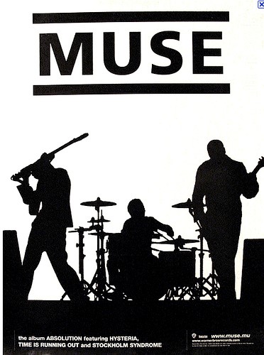
Muse

- Overall layout: The layout is neat and the information is placed onto the page in a structured manner, with the band name placed onto the top of the page advert. The main information is allocated at the bottom of the advert which is conventional as the advert should have a neat look to appeal to a mainstream audience.
- Star Motif and Popular Culture/ Hebdige Subculture: Within this advert, the band is promoting their values and believes through their image. This is evident through the picture, portraying the two side of their persona due to the black and white image. This can make the audience feel curious about the bands values and beliefs. The image is also professionally edited, as it divides the bands picture into two. The white side representing the good and joyful side, whereas the black representing the band as powerful and determinate.
- Typography: The typography used is simple and bold. The title is large in black colour with a white background, which stands out. Whereas the information is in white colour with a black background at the bottom of the advert which emphasises the importance of the band’s name without too much glamorisation, conventional of indie.
- Information: The information included in the advert is conventional as it includes the artist band name, and the name of the album, with the key singles and small print regarding the production company. This information is vital as it is the main factors that draws the audience in allowing them to decide on whether or not to purchase the album.
- Main Image/ Artist: The main image portrays the band playing instruments which is conventional as the audience can relate to them as well as make a realistic assumption about their skills and taste in music. When looking at this image the artist’s face cannot be seen, making the audience feel curious and wanting to find out more about the genre and type of band are they.
- Lighting and Colour: The colours used in the advert are black and white which connotes to the mysterious nature of the band and their music by also creating excitement making the audience have mixed emotions. This can provoke the audience curiosity which is common for indie.
What we plan to do:
- We would like to utilize a simple and clear layout which will informal our audience and not overthrow them. The easy layout will also allow for individualistic responses and personal decoding of our product
- We would like to use one image, without sub images, in order to avoid overcrowding.
- The typography will be bold and easy to read in order to grab the viewers’ attention but at the same time it will be easy to read.
- The star will be evident on the advert but will not be too glamorized or seek too much attention. Instead we will try to have an equal distribution of the artist and information which is conventional of indie.
Friday, 20 January 2017
Research and planning – Advert: Creative brief
Who are they?
Sarsha is a British performer who began her singing career
at a very young age. By the age of 6 she fluently played guitar and began her
piano lessons. During the development of her passion for instruments she began
singing and writing small tracks. At the age of 13 she signed up for an amateur
artist group where she met people with similar interest and hobbies. This
helped her to realise that music is her call. She uploaded a few covers on
social media however her true breakthrough began after she created her own song
‘Red Rash’ which gained her mass popularity, especially amongst the alternative
audiences who are attracted to her quirky song writing style and acoustic
sounds. She quickly began working on more products and at last was invited to
perform in prestigious indie clubs across London, including Cargo in
Shoreditch. Over time she signed up to independent record labels which led her
to finally work with a major record label, Polydor Records and become a part of
the Universal Group.
The album concept:
What is it?
We aim to create a product that will introduce an artist and
help her establish a credible fan base for her career. We will try to appeal to
a wide audience of mixed genders, various ethnic background and of age 15 and
above because the indie genre can appeal to anyone who is interested in
alternative music and sounds which means we will have to create a unique advert
that will appeal to different people. We also need to follow the common
conventions of indie jazz as we need to attract jazz fans in order to establish
Sarsha as such artist within the wide range of audience. Despite the advert being of a niche genre we
will make sure it includes the key elements that could appeal to the mainstream
audience and gain Sarsha more popularity.
Why are we doing it?
The advert is an example of synergy which will allow my
product to distribute across a global scale and help to inform my audience
about the upcoming album. As an upcoming artist Sarsha needs recognition and
the advert will support her in getting that. Therefore, the design of the
advert is crucial as it determinates the success of the whole campaign and will
need to work alongside other products. We must ensure the pictures, colours and
typography used will be conventional for the genre and visually appealing to
our audience and will establish Sarsha’s values and ideologies as well as
promoting the themes and mood evident in her music video to the consumers. The
themes within the album will include, love, addiction and self-disruption, with
the mood reflecting this. Therefore, the consumers will be able to understand
the Alternative/Jazz genre through the album, encouraging them to listen to her
music. This breakthrough will show audiences her style and attract appropriate
target audience. The advert will help Sarsha to attract audiences because we
are most likely to publish the advert in a music magazine which will possibly
attract music fanatics.
Comparable products:

These two adverts use a simple design which doesn’t glamourize their looks, conventional of indie artist. The simple colours allow the audience for an individualistic response due to its simplicity. The information provided is relevant and informs the audience. We plan to create a design which will correspond to out digipak. We plan to include the face of the artist but without glamourizing her which follows the common conventions of indie music.
The album concept:
The concept of Sarsha’s album, ‘Chine White’, will be to
connect her to her fans and a larger audiences ages 18-28, from different
ethnic groups and social backgrounds, particularly those from working class and
skilled working class backgrounds, who will be more likely to relate to
particular ideas and the Alternative Jazz genre. It will allow her to express
her authentic self through the use of her music, which she also took a part in
producing. The album reinforces Sarsha’s ideas and beliefs, allowing people to
get a clear picture of who she really is as a person. However, we will ensure
to make the album and its content appealing to the mass media, by including
video with original narratives and ideologies. This album has not only just
been created to increase her popularity but also to allow her to create a path
for other niche artist out there like her, however we are creating the album to
increase Sarsha’s popularity within the music industry making her more
internationally and globally well-known like other successful artists and
boosting her star image.
Audience:
The demographics of our target audience includes, skilled
working class people of different ethnic backgrounds, particularly female, aged
15 and above who can relate to the artist and the music video. We want the
audience to have a clear understanding about the artist and what she portrays
as well as enjoying her music and being able to relate to the certain themes
and ideologies she portrays throughout. In a way we want our audience to listen
to Sarsha and use her as a method of portraying realism, allowing them to be
aware of different mental health problems. We are also hoping the target
audience can build a different relationship with our artist, one that differs
from other mainstream artists, as Sarsha is original and should be recognised
for maintaining this quality.
How will we know that it worked?
The number of sales, and the sale figures will determine the
success of the album, allowing us to decide if the album is popular and
appealing to a mass audience. We will also host a focus group allowing a group
of consumers that reflect our target audience (aged 18-28, different ethnic
groups, working class/ skilled working class) to look at our first drafts of
our advert design provide us with feedback, which will allow us to make the
required changes and develop on the criticisms, making the final draft appealing
and suitable to our target audience meeting their expectations and interests.
Making the advert appealing to the target audience is crucial, as this factor
determines the ultimate success of the album, therefore, we will ensure we are
fully aware of the information revolving around our audience, including similar
products they like and what they like about it, their average earnings, their
hobbies/ interests etc. Understanding these factors will help us to make an
album that the audience will like and will be able to afford.
Launch dates:
Sarsha’s campaign dates:
Press campaign: 30th January 2017
TV Launch: 16th February 2017
Album Release: 14th February 2017
Any limitation that may occur:
We may struggle with consistency as we are responsible for
creating three products and must ensure all items have similarities to ensure
consistency throughout. The advert, therefore, it may be difficult to portray
the same themes and edit effect. In order to overcome this and ensure there is
consistency, we will keep editing the products and keep the lighting and
typography similar. We will also try to find appropriate images across our
ancillary products so there is no repetition and we will avoid artist overload
or lack of Sarsha image.
Subscribe to:
Posts (Atom)