Monday, 23 January 2017

Research and planning – Advert: Identifying conventions and analysing existing adverts

Purpose: 
  • Includes key information such as release dates for the audience to be aware of
  • Promotes the album for the artist
  • A form of synergy to promote the artist and album
  • Reminds the audience of the artist’s existence and the album, especially if they are an artist who is not regularly in the public eye, for example, Michael Buble, who only creates an album every Christmas, therefore the advert is a reminder for the audience.


What are the generic conventions? 
  • Album title
  • Artist name
  • Release date
  • Key singles
  • Where you can buy and stream
  • Artist image
  • Prental advisory logo if required


Analysing Existing Adverts

Kasabian


  • Main Artist: Despite promoting their debut album the band uses a simple image to advertise their music, instead of showing their own faces. This doesn’t allow the audience to familiarise with the band but puts them in apprehension. This shows that the band doesn’t try to glamourize themselves or their image for money but instead focus on their music. The simple main image portrays a male figure with a covered face which further conveys the sense of mystery and intrigues the audience. This is conventional of an indie rock band as they don’t try to sell their music through looks but the actual content of their products.
  • Lighting and Colour: The black and white are binary opposites and propose themes of ‘Good VS Evil’ or ‘Light VS Dark’ which could possibly pass a subtle message to the audience about the album or the band. Rock genre is known for controversial or original morals. In addition, black is a common colour associated with rock due to its connotations of evil and darkness. The simple use of colour allows the audience to draw individualistic connotations and possibly feel somewhat familiar with the poster which can intrigue them.
  • Typography: The bold and heavy typography compliments the genre of the product. Rock is associated with heavy and loud sounds. The simplicity of the typography compliments the overall image of the product and allows the audience to explore the product and decode the poster for themselves, basing on personal memories or experiences.
  • Information: The advert has relevant information about their album which notifies the audience about the product. It tells the audience that it is a debut which can intrigue them because they could look for new music.
  • Layout: The layout of the advert is clear. It gives the consumer some ‘room to breathe’ and isn’t overcrowded with unnecessary information or images which could scare the audience away. It is clear that this helps to give a sense of mystery for the audience and intrigue them into the product.
  • Hebdige’s Subcultures: The subcultures are likely to enjoy this product due to its vague presentation which would allow them to decode the product individually and draw own responses. This is appealing to subcultures who have an original style of thinking and are not afraid of responding to media text in their own way.
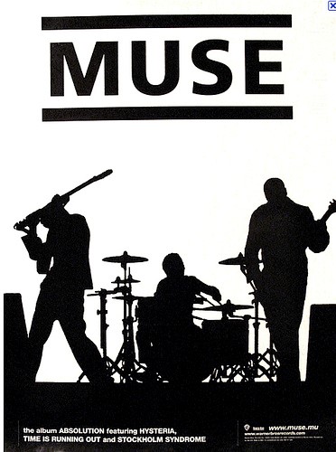

Muse


  • Overall layout: The layout is neat and the information is placed onto the page in a structured manner, with the band name placed onto the top of the page advert. The main information is allocated at the bottom of the advert which is conventional as the advert should have a neat look to appeal to a mainstream audience.
  • Star Motif and Popular Culture/ Hebdige Subculture: Within this advert, the band is promoting their values and believes through their image.  This is evident through the picture, portraying the two side of their persona due to the black and white image. This can make the audience feel curious about the bands values and beliefs. The image is also professionally edited, as it divides the bands picture into two. The white side representing the good and joyful side, whereas the black representing the band as powerful and determinate.
  • Typography: The typography used is simple and bold. The title is large in black colour with a white background, which stands out. Whereas the information is in white colour with a black background at the bottom of the advert which emphasises the importance of the band’s name without too much glamorisation, conventional of indie.
  • Information: The information included in the advert is conventional as it includes the artist band name, and the name of the album, with the key singles and small print regarding the production company. This information is vital as it is the main factors that draws the audience in allowing them to decide on whether or not to purchase the album.
  • Main Image/ Artist: The main image portrays the band playing instruments which is conventional as the audience can relate to them as well as make a realistic assumption about their skills and taste in music. When looking at this image the artist’s face cannot be seen, making the audience feel curious and wanting to find out more about the genre and type of band are they.
  • Lighting and Colour: The colours used in the advert are black and white which connotes to the mysterious nature of the band and their music by also creating excitement making the audience have mixed emotions. This can provoke the audience curiosity which is common for indie.


What we plan to do: 
  • We would like to utilize a simple and clear layout which will informal our audience and not overthrow them. The easy layout will also allow for individualistic responses and personal decoding of our product
  • We would like to use one image, without sub images, in order to avoid overcrowding.
  • The typography will be bold and easy to read in order to grab the viewers’ attention but at the same time it will be easy to read.
  • The star will be evident on the advert but will not be too glamorized or seek too much attention. Instead we will try to have an equal distribution of the artist and information which is conventional of indie.

Friday, 20 January 2017

Research and planning – Advert: Creative brief


Who are they?

Sarsha is a British performer who began her singing career at a very young age. By the age of 6 she fluently played guitar and began her piano lessons. During the development of her passion for instruments she began singing and writing small tracks. At the age of 13 she signed up for an amateur artist group where she met people with similar interest and hobbies. This helped her to realise that music is her call. She uploaded a few covers on social media however her true breakthrough began after she created her own song ‘Red Rash’ which gained her mass popularity, especially amongst the alternative audiences who are attracted to her quirky song writing style and acoustic sounds. She quickly began working on more products and at last was invited to perform in prestigious indie clubs across London, including Cargo in Shoreditch. Over time she signed up to independent record labels which led her to finally work with a major record label, Polydor Records and become a part of the Universal Group.

The album concept:

What is it?

We aim to create a product that will introduce an artist and help her establish a credible fan base for her career. We will try to appeal to a wide audience of mixed genders, various ethnic background and of age 15 and above because the indie genre can appeal to anyone who is interested in alternative music and sounds which means we will have to create a unique advert that will appeal to different people. We also need to follow the common conventions of indie jazz as we need to attract jazz fans in order to establish Sarsha as such artist within the wide range of audience.  Despite the advert being of a niche genre we will make sure it includes the key elements that could appeal to the mainstream audience and gain Sarsha more popularity.

Why are we doing it?

The advert is an example of synergy which will allow my product to distribute across a global scale and help to inform my audience about the upcoming album. As an upcoming artist Sarsha needs recognition and the advert will support her in getting that. Therefore, the design of the advert is crucial as it determinates the success of the whole campaign and will need to work alongside other products. We must ensure the pictures, colours and typography used will be conventional for the genre and visually appealing to our audience and will establish Sarsha’s values and ideologies as well as promoting the themes and mood evident in her music video to the consumers. The themes within the album will include, love, addiction and self-disruption, with the mood reflecting this. Therefore, the consumers will be able to understand the Alternative/Jazz genre through the album, encouraging them to listen to her music. This breakthrough will show audiences her style and attract appropriate target audience. The advert will help Sarsha to attract audiences because we are most likely to publish the advert in a music magazine which will possibly attract music fanatics.


Comparable products:


These two adverts use a simple design which doesn’t glamourize their looks, conventional of indie artist. The simple colours allow the audience for an individualistic response due to its simplicity. The information provided is relevant and informs the audience. We plan to create a design which will correspond to out digipak. We plan to include the face of the artist but without glamourizing her which follows the common conventions of indie music.


The album concept:

The concept of Sarsha’s album, ‘Chine White’, will be to connect her to her fans and a larger audiences ages 18-28, from different ethnic groups and social backgrounds, particularly those from working class and skilled working class backgrounds, who will be more likely to relate to particular ideas and the Alternative Jazz genre. It will allow her to express her authentic self through the use of her music, which she also took a part in producing. The album reinforces Sarsha’s ideas and beliefs, allowing people to get a clear picture of who she really is as a person. However, we will ensure to make the album and its content appealing to the mass media, by including video with original narratives and ideologies. This album has not only just been created to increase her popularity but also to allow her to create a path for other niche artist out there like her, however we are creating the album to increase Sarsha’s popularity within the music industry making her more internationally and globally well-known like other successful artists and boosting her star image.

Audience:

The demographics of our target audience includes, skilled working class people of different ethnic backgrounds, particularly female, aged 15 and above who can relate to the artist and the music video. We want the audience to have a clear understanding about the artist and what she portrays as well as enjoying her music and being able to relate to the certain themes and ideologies she portrays throughout. In a way we want our audience to listen to Sarsha and use her as a method of portraying realism, allowing them to be aware of different mental health problems. We are also hoping the target audience can build a different relationship with our artist, one that differs from other mainstream artists, as Sarsha is original and should be recognised for maintaining this quality. 

How will we know that it worked?

The number of sales, and the sale figures will determine the success of the album, allowing us to decide if the album is popular and appealing to a mass audience. We will also host a focus group allowing a group of consumers that reflect our target audience (aged 18-28, different ethnic groups, working class/ skilled working class) to look at our first drafts of our advert design provide us with feedback, which will allow us to make the required changes and develop on the criticisms, making the final draft appealing and suitable to our target audience meeting their expectations and interests. Making the advert appealing to the target audience is crucial, as this factor determines the ultimate success of the album, therefore, we will ensure we are fully aware of the information revolving around our audience, including similar products they like and what they like about it, their average earnings, their hobbies/ interests etc. Understanding these factors will help us to make an album that the audience will like and will be able to afford.

Launch dates:

Sarsha’s campaign dates:
Press campaign: 30th January 2017
TV Launch: 16th February 2017
Album Release: 14th February 2017

Any limitation that may occur:

We may struggle with consistency as we are responsible for creating three products and must ensure all items have similarities to ensure consistency throughout. The advert, therefore, it may be difficult to portray the same themes and edit effect. In order to overcome this and ensure there is consistency, we will keep editing the products and keep the lighting and typography similar. We will also try to find appropriate images across our ancillary products so there is no repetition and we will avoid artist overload or lack of Sarsha image.

Research and planning – Digipak: Identifying conventions and analysing existing digipaks

Purpose:

  • Marketing tool that sells/promotes the album
  • Displays indirect information such as the ideologies of the artist
  • Creates, adapts or feeds into the representation of the 'star image'
  • A product to keep hold of, can be a collectors item
  • Attract a particular target audience
  • Buy into artist lifestyle and ideas
  • An everlasting product that will symbolise the artist and the album.
  • Form of synergy- advertising and promotion
  • Creates a relationship between the artist and audience

What are the generic conventions?

The generic conventions of a digipak includes:
  • Artist image
  • Tracklist
  • Parental advisory label
  • Record label
  • Barcode
  • Album title
  • Company details
  • Critical sticker


Analyse two examples that are similar to your genre/artist


Catfish and the Bottlemen: The Balcony


Title of the Album: The Balcony: The album name is not very specific nor does link with the image therefore it is hard for the audience to tell exactly what the artist means. However, this vagueness allows the audience to look into the album themselves and possibly research more which engages them with the band and product more. This is common for indie bands who often use unique names for their album in order to convey an ‘inside’ message for their audience.

Star Motif: The vague album shows that the artist might want their audience to explore their music and album but at the same time conveys a sense of mystery. They value minimalism and show that audience that sometimes ‘less is more’.

Overall layout: In general, the layout of the album is neat. The design and the writing correspond well and don’t interfere with each other spacing. The album is not overcrowded which allows the audience to ‘breathe’.

Popular Culture/ Hebdige Subculture: Catfish and the Bottlemen are a British indie-rock band. This makes their style to be very distinct and unique which appeals to a minority rather than a global mainstream audience. The album has some explicit language and shows a true expression from the artist and their point of view on different ideas, whether political, cultural or societal. They are not afraid to be who they’re and cause controversy around their style of thinking which makes them a niche band. This allows subcultures to identify with the band as they have their own unique style and like to express themselves and stay true to their lifestyles. Therefore, as a minority they can identify with the niche band who is also not afraid to stand out. The design itself is also appealing to subcultures due to its simplicity, which the subcultures can decode themselves and find somehow familiar. In addition, the explicit illustration is controversial and provocative and subcultures often cause controversy due to their rejections of mainstream values and repelling hegemony.

Typography: The typography of this design is simple and easy to read. The band’s name is written in a consistent typography which they use on all of their previous works and merchandise. This allows the audience to familiarize with one design and recognize it amongst many other products. The simplicity of the typography shows the consumer that the band isn’t trying to glamourize itself but simply supply their fans with good music.

Information: The digipak includes generic information like a barcode, which is a necessity. It also has the logos of its production company/ music label which is also necessary due to the bands contract and legal reasons. There is a track list which informs the audience of the music available and the copyright information at the back of the album.

Main Image/ Artist: The main image of the album is a simple illustration of headless figures who have their hands touching one another’s genitals. The simple line image allows the audience for an individualistic response basing on their own memories or experiences. They are able to decode the image for themselves. By using such illustration, the artist is able to show their niche appeal due to its unique design but at the same time shows that they don’t glamourize themselves. It can also convey they sense of humor which is appealing for the audience and allows the consumer to familiarize with their personality.

Lighting and Colour: The black and white helps to convey the indie rock genre due to its heavy contrast. It will attract the correct target audience who are familiar with the common conventions of rock. The simple colours show that the band values their music more than expensive advertisement.

                         
Shura: Nothing’s Real


Title of the Album: The album is titled ‘Nothing’s Real’ which reflects the creative and ambiguous side of the album and the artist. It is also easy to read and understand as it is short and snappy, making it more appealing as it is also an intertextual reference to one of John Lennon’s quote which broadens the appeal.

Star Motif: The artist’s ideologies and values are evident through the image, portraying the two side of her persona. This can make the audience feel curious about her character and her beliefs. The image is also professionally edited, as it divides the artist picture into two. The first one, which is colourful and dominant, suggesting reality, whereas the second one, which is black and white to represent a fantasy world, something surreal.  These two images juxtaposed each other in a delightful way.

Overall layout: The layout is neat and the information are placed onto the page is a structured manner, with the artist name placed onto the top-left corner and the album title under it.  The track list is listed on the back cover with a simple font, just as the album title. However, the back cover seems empty but it looks professional and it is conventional for its music genre due to the audience expecting simple designs but good music.  This lead to mysteriousness which makes the viewers want to purchase the album.

Popular Culture/ Hebdige Subculture: Although she fits in with popular culture due to her image, she also appeals to subcultures as she is not the ‘ideal’, girly female artist that all females can relate to. Therefore, she appeals to both hegemonic community and subcultures which broadens her appeal.
Typography: The typography used is simple and bold. The small size of the writing infers that the blue connotes loneliness where the main artist is trying to show her emotions. The blue shows that empty space is hard to fill, which allows people to relate to as today many of us experience burdens in some way or another.

Information: The information included in the digipak is conventional as it includes the artist name, album title, barcode, track list and small print regarding the production company.
Main Image/ Artist: The main image portrays the main artist who is looking away from the camera. Her facial expression suggest that she is thoughtful and serious. Despite the close up, the image doesn’t glamourize or sexualise her which conveys the indie genre.

Lighting and Colour: The lighting used in this digipak is high key lighting which corresponds to the light colours and helps to show her facial expression. The colours used are dull green and blues which connotes to her deep emotions as well as the theme of fantasy and non-realistic vision. 


Ideas we plan to use:

  • Consistent typography which will be recognizable for our audience and allow them to always distinguish our artist amongst others.
  • Create an album name that is not too obvious but something that will link to the overall message and theme of the product. Something that will intrigue the consumer and want them to find out more about the album or artist.
  • Have a simple layout and images which will not interfere with the writing too much. We will try to avoid overcrowding information in order to create a professional product which will be easy to look at for the audience.
  • Include the key information which are necessary on every product.
  • Use colours that will link to our genre in order to grab our target audience attention and make sure we appeal to the right consumer. This will help to increase the number of our sales and we will have a satisfied audience.
  • The idea of altering the artist image, just like Shura did in her album.


Conclusion:


This research task was very beneficial to our understanding of digipaks. It helped us to see what successful products have in common and how they use conventions effectively in order to attract their target audience successfully. This is important because by using incorrect conventions you are at risk of not selling your product and making a loss, thus not breaking to the global audience. In order to secure our success, we have identified key features that our product will include and therefore began to plan what our digipak will look like. By planning this beforehand we are able to create drafts of our design and keep on consulting our audience for their feedback which will ensure we fit their expectations. Some of the conventions we settled on was a name that will be vague but link to the theme of self-disruption and work alongside our video, track list and image which shows consistency and convey the meaning of our products effectively.

Tuesday, 20 December 2016

Research and planning – Advert: Advert information

Album name: China White: We have decided to call our album China White as we believe the name is short and mysterious and can relate to the album as we believe that the songs within the album will evoke confusion and curiosity from the audience. We also decided to go with 'China White' because it is a nick name for a drug which connotes to the drug abuse the artist experienced and is a consistent theme within our products.

Release date: 14th February 2017: We have chosen our release date to be the 14th of February 2017 because it’s the day were couples enjoy their day together, meaning that the song that touch up on themes such as love, relationship etc. will be more appropriate and meaningful for the target audience. Also by choosing to release the album on this day it will come after the press campaign and TV launch which will all be important campaigns in ensuring that our album and artist are recognised, and encourage the target audience to look forward to the album release- there will be hype surrounding it. Choosing to release the album in the middle of the month allows us time to advertise it properly allowing the audience to anticipate the artist’s newest songs, causing them to wait in suspense.

Available to download:  We have decided to use the well-established download sites /apps including; ITunes, Spotify and Tidal as these are globally recognised by a mass audience and will therefore allow our artist to become more successful despite being a niche artist. We have also decided to make the songs available to download from various sites/apps as the mass audience use different ones, therefore, in order for our album to sell, it is vital that we can offer a variety of download options for the audience, encouraging them to download the album.

Key singles: We have decided that China White, Cloud 9 and Black Beauties will be our three key singles, including “You Complete Me'' which is the ultimate key single, considering that we created a music video to it. 'Black Beauties' is a song that appeals to a mainstream audience, and can be relatable due to the themes it includes, including love and abuse. ‘Cloud 9’ is the most unique song out of her singles, as it is different in that the artist promotes niche themes which is reflected through the lyrics and the theme of morality which is a debatable and individualistic topic.

Explicit lyrics label: No - We will not be including an 'Explicit lyrics label' as the songs within the album do not contain any upsetting language. This is common within the indie genre and generally it is uncommon for artist to use such expressions because of its target audience and general audience expectations.

Setting of image: We will capture the images in dark locations, such as against black walls, behind a green screen, and then we will apply a background that highlights the dark atmosphere to reflect the mystery and tension that is expressed within the album. We also include images of wine and cigarettes to emphasise the addiction of the artist and what she is going through. It is vital that the setting of the image is effective and fits in with the rest of the album information and images to ensure there is consistency throughout the advert.

Costume hair and make-up of the artist: We plan on using a black coat and boots to further emphasise her class. Additionally, we want the artist to dress like a classy woman who is clearly financially stable and doesn’t lack money/ possessions etc. This will create a sense of superiority and intimidation from her and the audience will admire and aspire to be like her. The character will mainly wear dark clothing to convey her depressing thoughts and addiction to drugs. She will wear a winter coat, to show that she is longing for ‘warmth’ from others but also protection from the situation she is in. Sarsha will also wear a red lipstick and a light eye makeup which will be smudged on her face to show her vulnerability and unconventional beauty. It also helps to portray her addiction which is common of indie adverts as they don’t use make up to glamourize the artists. Stereotypically having blond hair shows innocence and vulnerability, therefore we decided that the main artist should be blonde to draw an audience response. 

Cinematography: For our advert we decided to take a medium long shot of our artist. This is because it will help to convey the mood of the album through her body language but at the same time clearly portray her smudged make up which will give the audience a deeper insight into her life and her character. A medium close up will not glamourize her which is conventional for an indie artist who rarely ever use their looks to attract audiences, unlike the popular and mainstream artists today.

Lighting and colour: We intend to use low key lighting to convey the sad and miserable mood of the album and dangerous side effects of drugs which is the main theme of our product. However, we will use top lighting to make the artist seem vulnerable, especially due to her addiction. It will also show consistency as in the video the artist will stand under a lamp to hint prostitution which creates deeper meanings for the audience.

Friday, 16 December 2016

Research and planning – Digipak: Digipak Information

Artist name:

When deciding on an artist name we wanted to ensure we promoted originality therefore we choose the name; Sarsha for our artist. Sarsha is a different kind of name that stands out from the norm. We chose this name as it is simple to write and say, and is catchy. Therefore, we believe this name is suitable for our artist as it is reflective of her unique persona and establishes her ideologies too. Its originality matches the alternative style of our product.

Album name:

We have decided to name our album, ‘China White’ as we believe that it reflects the music genre and also because it’s a universal idea because some people will react on this title individually. In addition, it is not obvious as to its content and will evoke a sense of mystery in our audiences. In reality China White refers to drugs which shows that the artist addresses upon the theme of addictions and important issues which is conventional of the indie genre. Furthermore, we can connote China White with porcelain which is a fragile material just like the victims of drugs. These connotations will enhance the album. Therefore, we believe this album name is suitable and encourage a wider audience to buy it. It is important that the album name is catchy and appealing to the target audience as it is one of the first things as well as the picture that draws the audience to the album, and determines whether they will buy the album. We have also decided to name the album ‘China White’ as the simplicity of it is suitable for the target audience who will be from working class backgrounds, aged 15+.

Track list:

The track list we have chosen includes nine songs and one bonus track, which are all similar in that they all draw upon similar themes, including, self-disruption, loneliness and addiction. These are common themes associated with the Alternative/Jazz genre and appeal to the target audience who are most likely to be able to relate to these themes as a result of them being the right age group who are likely to experience love and relationships most. In addition, the tracks all relate to drugs in some sense to help the artist address an important issues of addictions which is prominent within today’s society.

The tracks on the track list include:

1)      Dying Whisper
2)      Lost in Wonderland
3)      Wine & Cigarettes
4)      Black Beauties
5)      Cloud 9
6)      Poor Man’s Ecstasy
7)      Happy Pills
8)      China White
9)      You Complete Me

Bonus Track:

10)  I didn’t think enough

We have chosen various different track names, which do not all promote the themes through their title, instead certain track names such as ‘Black Beauties’ and ‘Dying Whisper' reinforce suspense and interest, which we done intentionally to create this impact from the audience. By using less obvious track names we gain a sense of mystery and can be individualistic for the audience.

Music Institution:

We decided to use Polydor Records who are part of the Universal Music Group. This institution in an American worldwide music conglomerate. It is a subsidiary of a French company, Vivendi. They own a number of different record labels such as Capitol Records. Universal specializes in the mainstream and current artists. However, their subsidiary record labels sign up indie artist which gives them a mass appeal. Polydor Records work alongside Lana Del Rey who is a successful indie performer. By using the same music institution, I will be able to gain some attention through below the line marketing. In addition, Shura is also part of the company which is another popular female indie artist that our artist will associate with. The institution is already established which gives us more financial stability and security which will aid us when trying to debut an artist.

Production Company:

Our production company is called ‘The UnknOwn Duo’. We decided that it is mysterious and catchy to remember therefore is likely to sell. In addition, our logo is simple and not ‘flashy’ which matches the alternative and indie genre of our product. 

Explicit Lyrics Label:


We decided to leave out the ‘Explicit Lyrics’ label because the song and our overall product is unlikely to upset anyone. In addition, indie/ jazz genre doesn’t associate with swearing or explicit language therefore there is no need to insert the label as this type of music avoids such content due to its mature feel.

Research and planning – Digipak: Creative brief

Oasis Academy Hadley
5 South Street
EN3 4PX
Bibi.Noshib@oasishadley.org


Date: 16/12/2016   
Album Title/artist: ‘China White’ by Sarsha
Project Manager: Bibi Noshib
Release Date: 14th February 2017

Product Overview:

Sarsha is a British performer who began her singing career at a very young age. By the age of 6 she fluently played guitar and began her piano lessons. During the development of her passion for instruments she began singing and writing small tracks. At the age of 13 she signed up for an amateur artist group where she met people with similar interest and hobbies. This helped her to realise that music is her call. She uploaded a few covers on social media however her true breakthrough began after she created her own song ‘Red Rash’ which gained her mass popularity, especially amongst the alternative audiences who are attracted to her quirky song writing style and acoustic sounds. She quickly began working on more products and at last was invited to perform in prestigious indie clubs across London, including Cargo in Shoreditch. Over time she signed up to independent record labels which led her to finally work with a major record label, Polydor Records and become a part of the Universal Group.


The Album concept:

What is it?

We aim to create a product that will introduce an artist and help her establish a credible fan base for her career. We will try to appeal to a wide audience of mixed genders, various ethnic background and of age 15 and above because the indie genre can appeal to anyone who is interested in alternative music and sounds which means we will have to create a unique digipak that will appeal to different people. We also need to follow the common conventions of indie jazz as we need to attract jazz fans in order to establish Sarsha as such artist within the wide range of audience.  Despite the digipak being of a niche genre we will make sure it includes the key elements that could appeal to the mainstream audience and gain Sarsha more popularity.

Why are we doing it?

The reason we are trying to do this is because Sarsha’s debut will need to bring success to an international and possibly a global audience, and the creation of the digipak will support her in doing so. Therefore, the design of the digipak is crucial as it determinates the success of it. We must ensure the pictures, colours and typography used will be conventional for the genre and visually appealing to our audience and will establish Sarsha’s values and ideologies as well as promoting the themes and mood evident in her music video to the consumers. The themes within the album will include, love, addiction and self-disruption, with the mood reflecting this. Therefore, the consumers will be able to understand the Alternative/Jazz genre through the album, encouraging them to listen to her music. This breakthrough will show audiences her style and attract appropriate target audience.


Comparable products:


We believe that these products are comparable to our production. Shura is a successful British alternative artist, therefore we looked at her recent digipak to gain ideas of what makes her so successful. We like her experimental use of effects as they enhance her simple album covers which is something we would like to achieve to engage our audience. In addition, we looked at Catfish and the Bottlemen because they are an indie British band who use simple designs and interesting colours to suit the indie genre. We think the white outline drawings are effective and allow for individualistic responses from the audience. Lastly the recent Lady Gaga album has also inspired us. Gaga is known for her unconventional designs however lately her works have been ‘toned’ down and we like the simple products. Therefore, we decided to use her as an influence.

What is the reaction we want?

The demographics of our target audience includes, skilled working class people of different ethnic backgrounds, particularly female, aged 15 and above who can relate to the artist and the music video. We expect the audience and consumers to feel they have a clearer understanding about the artist, enjoying her music and being able to relate to the certain themes and ideologies she portrays throughout. In a way we want our audience to listen to Sarsha and use her as a method of portraying realism, allowing them to be aware of different mental health problems. We are also hoping the target audience can build a different relationship with our artist, one that differs from other mainstream artists, as Sarsha is original and should be recognised for maintaining this quality.

How will we know it worked?

The number of sales, and the sale figures the album receives will determine the success of the album, but also the views from social media such as YouTube, Facebook etc. will allow us to decide if the album is popular and appealing to a mass audience. We will also host a focus group allowing a group of consumers that reflect our target audience (aged 15+, different ethnic groups, working class/ skilled working class) to look at our first drafts of our album designs and provide us with feedback, which will allow us to make the required changes and develop on the criticisms, making the final draft appealing and suitable to our target audience meeting their expectations and interests. This is crucial, as this factor determines the ultimate success of the album, therefore, we will ensure we are fully aware of the information revolving around our audience, including similar products they like and what they like about it, their average earnings, their hobbies/ interests etc. Understanding these factors will help us to make an album that the audience will like and will be able to afford.

Launch dates:

Sarsha’s campaign dates:

Press campaign: 30th January 2017
TV Launch: 16th February 2017
Album Release: 14th February 2017

Limitations:

We may struggle with consistency as we are responsible for creating three products and must ensure all items have similarities to ensure consistency throughout. In order to overcome this and ensure there is consistency, we will keep editing the products and keep the lighting and typography similar.

We will also try to find appropriate images across our ancillary products so there is no repetition and we will avoid artist overload or lack Sarsha image.

Friday, 25 November 2016

Planning: Group Roles

Production roles are the jobs that are assigned to a member of the production and these are the people who take care of the area to which they have been placed into. In the industry, often these people are professionals and each one is hired to complete the task in the field of their strength, because they specialize in it. These are the members that create the ‘film crew’ and build the film; allowing it to happen. However, because there is only a limited number of members in our group we had to take more than one role. These are the roles that we had to distribute between one another:

  • Director
  • Editor
  • Location Manager
  • Lighting Operator
  • Producer
  • Camera Operator
  • Storyboard Organizer
  • Costume, hair and make-up artist
  • Print Designer
  • Photographer
  • Cast Control


These roles are important because without a clear organization of who is in charge of what we would be in chaos and mess, not knowing what to get on with. Production roles are very important because it can help to distribute roles equally, thus making sure that no one is overloaded with work as well as everyone works in their preferred field which they feel passionate about and can work to the best of their ability.

The Different Roles Available:

Director: a film director is in charge of the visualization of the script by guiding the filming crew as well as actors in order to complete his/her vision. It is in fact the director’s role to choose the cast as well as other members which he/she then closely works with to complete the film and bring it to life. Directors need to look out for others and make sure to give constructive feedback in order to improve the work of the crew. On top of that they need to stay organized and within the film budged. A director has to be responsible and feel confident with his/her decisions and teamwork skills. We have decided that I should take on the role of the director because I am capable of managing a group as well as giving constructive feedback and guiding others during their work. Additionally, I have good leadership skills and I am also hard working and will be able to supervise everything well.

Producer: film producers take on a variety of roles no matter if they are independent or employed. Producers cooperate many aspects of the film such as selecting a script, which would then be given to the director, being in charge of the finance and budgeting. Producers cannot always personally supervise all of the production. Therefore, they are entitled to hire executive or line producers who altogether with the director will help to finish the film making. However, it is the producer who has the last word on music, editing and everything else within the production. We decided that I will be the producer of our music video because I can cooperate well, as well as has many skills which will enable me to make good decisions for our campaign and make sure that our production runs well and will be successful. Additionally, I am well organized and able to help my pair to stay on top of the task and complete this without many difficulties.

Editor: a film editor is part of the production. Their job is to work with the raw material of shots and frames and place them together in order to create a whole; according to the script and overall concept of this production. They add all the transitions as well as the edits in order to enhance the sequence. Often if the editing stage goes well it is not visible nor noticeable for the audience. Editor must work intensively by developing the footage as well as complementing it with sound, pace and acting for the film to make sense and look as realistic as possible. Editors play a massive role in the film industry because this is a time consuming and hard job which is often unrecognized by the spectators.  We decided to do this job together because we are hardworking and patient. We also believe that we have the required skills for editing videos in a professional way, thus we will be charge of it.

Location Manager: a location manager is a crew member who is in charge of finding an appropriate location, accordingly to the director, and securing it for the filming. They need to gain permission from the authorities and let them know the exact situation and plans of how the crew wants to use the space. The location manager also has to emerge with the possible issues that could arise during the filming and if the authorities are convinced and know that no one’s safety will get violated they will allow to film. These members will work with the production designer and director to find the most appropriate place that will fit the director’s vision. In our team we have decided that Natalia will take care of the location management. This is because she knows a lot of possible settings that would fit our narrative and give us the right conditions to film. She is also polite and will be able to ask for permission to film in the intended location.

Lighting Operator: these are in charge of controlling artificial lights during the filming process. They work with the director and cinematographer/ story boarder to help pursue the vision.  Lighting operators are responsible for the movement and set up of lighting equipment to create shadow or necessary lighting in the scene or specific character.  They may also lay electrical cables, wire fixtures, install colour effects or image patterns, focus the lights, and help out during the placement of additional effects during the editing stages. The role of light operators is risky because it involves hot and heavy objects therefore this role must be taken by someone responsible. Natalia was nominated to be in charge of lighting. This is because she knows a lot about the different lighting techniques and how to use it effectively in order to help create a character representation and cause an audience response. Additionally, we have considered that this is a risky job but she will be responsible enough to take care of her own and others safety.

Camera Operator/ Camera Person: in the film production these members are often called the cinematographers. The camera operators are in charge of operating the camera and trying to use a variety of cinematography techniques to enhance the sequence as well as create a character representation. If done fluently, cinematography is often unnoticeable for the eye and comes naturally for the viewer. Throughout the production the cinematographer will work with the director and story boarder to help pursue the idea and vision. Often the camera person needs to be creative and have a talent for picking up naturalistic shots. They usually have many camera assistants in order to capture the best shots which then get send off to the editor. We decided that I will take the role of the cinematographer. This is because I am the director too and I will be able to pursue my vision clearly and accurately.

Storyboard Organizer: the storyboard organizer has to make sure that the story drawn by the artist flows and has fluency to it as well as complements the script. They have to make sure that everything is right before submitting the idea to the director who needs to approve it before filming. The organizer works with the artists in order to make sure that no further amendments need to be made so the filming can begin as soon as possible. We decided that Natalia will take care of the storyboard because she likes to draw and will be able to visualize the narrative easily. This is important because without this the cinematographers will not be able to film the footage accurately. Therefore, together we will work on our production hand in hand.

Costume, hair and make-up artist: the artist work closely with the actors as well as the director in order to pursue a believable and appropriate character that will suit the director’s vision. These artists apply prosthetic onto the actor to make them suitable for their role. They are in charge of picking the costume and hair styles which need to be approved by the director. This is an important job as they are in charge of creating character representations which need to be conveyed to the audience and if these are done inaccurately then the film would not attract the intended target audience. We decided that I will be the costume, hair and make- up artist. This is because I am a creative person and will be able to pursue the exact and accurate character representation which is necessary in a film so the viewers will know exactly who everyone is.

Print designer: print designers use their technical skills to arrange and style designs as they appear on a page. Their design activities include choosing font types, sizes and colours to create attractive headlines and text-based presentations that will catch the reader’s attention. We have decided that we will be responsible for print design as we are creative and good at producing designs and make something effective from nothing. This will not only be beneficial when creating the digipak as we will be required to create an effective poster type pack which include images and colours, but also as a pair we will have more ideas and opinions on how to present our posters.

Photographer: A photographer is someone who takes photographs of something and uses the photo in various ways, which may include, album covers, posters, social networking sites, newspapers, magazines etc. A photographer should be skilful when holding and positioning a camera to ensure they take high quality photographs. We have decided that I will be responsible for the photography, taking pictures of the artist and characters, scenery etc. for the digipak, as I have a steady hand and I am also able to hold the camera in a unique way that will allow me to capture different shots effectively.

Cast control: This is someone that takes charge of the cast who is responsible of the cast members, ensuring all the artist have arrived on set and are behaving appropriately, doing what they are required to do.  We have decided that I will be responsible for cast control as I am able to be strict and serious if necessary which is appropriate in this case, as I must encounter these attributes to handle the cast members and ensure they are doing the correct thing.


Conclusion:

Overall, this task was beneficial because it helped us to assign the roles to our members as well as chose the roles for ourselves which will allow our duo to stay coordinate. After completing this task, we identify our qualities, strengths and weaknesses, and according to these qualities we have been able to fairly decide who to allocate to each role. We have chosen roles best suited to our abilities and personas. We are aware that certain roles hold more significance over others, therefore, we distributed roles equally ensuring that each of us held a major role.