Tuesday 20 December 2016

Research and planning – Advert: Advert information

Album name: China White: We have decided to call our album China White as we believe the name is short and mysterious and can relate to the album as we believe that the songs within the album will evoke confusion and curiosity from the audience. We also decided to go with 'China White' because it is a nick name for a drug which connotes to the drug abuse the artist experienced and is a consistent theme within our products.

Release date: 14th February 2017: We have chosen our release date to be the 14th of February 2017 because it’s the day were couples enjoy their day together, meaning that the song that touch up on themes such as love, relationship etc. will be more appropriate and meaningful for the target audience. Also by choosing to release the album on this day it will come after the press campaign and TV launch which will all be important campaigns in ensuring that our album and artist are recognised, and encourage the target audience to look forward to the album release- there will be hype surrounding it. Choosing to release the album in the middle of the month allows us time to advertise it properly allowing the audience to anticipate the artist’s newest songs, causing them to wait in suspense.

Available to download:  We have decided to use the well-established download sites /apps including; ITunes, Spotify and Tidal as these are globally recognised by a mass audience and will therefore allow our artist to become more successful despite being a niche artist. We have also decided to make the songs available to download from various sites/apps as the mass audience use different ones, therefore, in order for our album to sell, it is vital that we can offer a variety of download options for the audience, encouraging them to download the album.

Key singles: We have decided that China White, Cloud 9 and Black Beauties will be our three key singles, including “You Complete Me'' which is the ultimate key single, considering that we created a music video to it. 'Black Beauties' is a song that appeals to a mainstream audience, and can be relatable due to the themes it includes, including love and abuse. ‘Cloud 9’ is the most unique song out of her singles, as it is different in that the artist promotes niche themes which is reflected through the lyrics and the theme of morality which is a debatable and individualistic topic.

Explicit lyrics label: No - We will not be including an 'Explicit lyrics label' as the songs within the album do not contain any upsetting language. This is common within the indie genre and generally it is uncommon for artist to use such expressions because of its target audience and general audience expectations.

Setting of image: We will capture the images in dark locations, such as against black walls, behind a green screen, and then we will apply a background that highlights the dark atmosphere to reflect the mystery and tension that is expressed within the album. We also include images of wine and cigarettes to emphasise the addiction of the artist and what she is going through. It is vital that the setting of the image is effective and fits in with the rest of the album information and images to ensure there is consistency throughout the advert.

Costume hair and make-up of the artist: We plan on using a black coat and boots to further emphasise her class. Additionally, we want the artist to dress like a classy woman who is clearly financially stable and doesn’t lack money/ possessions etc. This will create a sense of superiority and intimidation from her and the audience will admire and aspire to be like her. The character will mainly wear dark clothing to convey her depressing thoughts and addiction to drugs. She will wear a winter coat, to show that she is longing for ‘warmth’ from others but also protection from the situation she is in. Sarsha will also wear a red lipstick and a light eye makeup which will be smudged on her face to show her vulnerability and unconventional beauty. It also helps to portray her addiction which is common of indie adverts as they don’t use make up to glamourize the artists. Stereotypically having blond hair shows innocence and vulnerability, therefore we decided that the main artist should be blonde to draw an audience response. 

Cinematography: For our advert we decided to take a medium long shot of our artist. This is because it will help to convey the mood of the album through her body language but at the same time clearly portray her smudged make up which will give the audience a deeper insight into her life and her character. A medium close up will not glamourize her which is conventional for an indie artist who rarely ever use their looks to attract audiences, unlike the popular and mainstream artists today.

Lighting and colour: We intend to use low key lighting to convey the sad and miserable mood of the album and dangerous side effects of drugs which is the main theme of our product. However, we will use top lighting to make the artist seem vulnerable, especially due to her addiction. It will also show consistency as in the video the artist will stand under a lamp to hint prostitution which creates deeper meanings for the audience.

Friday 16 December 2016

Research and planning – Digipak: Digipak Information

Artist name:

When deciding on an artist name we wanted to ensure we promoted originality therefore we choose the name; Sarsha for our artist. Sarsha is a different kind of name that stands out from the norm. We chose this name as it is simple to write and say, and is catchy. Therefore, we believe this name is suitable for our artist as it is reflective of her unique persona and establishes her ideologies too. Its originality matches the alternative style of our product.

Album name:

We have decided to name our album, ‘China White’ as we believe that it reflects the music genre and also because it’s a universal idea because some people will react on this title individually. In addition, it is not obvious as to its content and will evoke a sense of mystery in our audiences. In reality China White refers to drugs which shows that the artist addresses upon the theme of addictions and important issues which is conventional of the indie genre. Furthermore, we can connote China White with porcelain which is a fragile material just like the victims of drugs. These connotations will enhance the album. Therefore, we believe this album name is suitable and encourage a wider audience to buy it. It is important that the album name is catchy and appealing to the target audience as it is one of the first things as well as the picture that draws the audience to the album, and determines whether they will buy the album. We have also decided to name the album ‘China White’ as the simplicity of it is suitable for the target audience who will be from working class backgrounds, aged 15+.

Track list:

The track list we have chosen includes nine songs and one bonus track, which are all similar in that they all draw upon similar themes, including, self-disruption, loneliness and addiction. These are common themes associated with the Alternative/Jazz genre and appeal to the target audience who are most likely to be able to relate to these themes as a result of them being the right age group who are likely to experience love and relationships most. In addition, the tracks all relate to drugs in some sense to help the artist address an important issues of addictions which is prominent within today’s society.

The tracks on the track list include:

1)      Dying Whisper
2)      Lost in Wonderland
3)      Wine & Cigarettes
4)      Black Beauties
5)      Cloud 9
6)      Poor Man’s Ecstasy
7)      Happy Pills
8)      China White
9)      You Complete Me

Bonus Track:

10)  I didn’t think enough

We have chosen various different track names, which do not all promote the themes through their title, instead certain track names such as ‘Black Beauties’ and ‘Dying Whisper' reinforce suspense and interest, which we done intentionally to create this impact from the audience. By using less obvious track names we gain a sense of mystery and can be individualistic for the audience.

Music Institution:

We decided to use Polydor Records who are part of the Universal Music Group. This institution in an American worldwide music conglomerate. It is a subsidiary of a French company, Vivendi. They own a number of different record labels such as Capitol Records. Universal specializes in the mainstream and current artists. However, their subsidiary record labels sign up indie artist which gives them a mass appeal. Polydor Records work alongside Lana Del Rey who is a successful indie performer. By using the same music institution, I will be able to gain some attention through below the line marketing. In addition, Shura is also part of the company which is another popular female indie artist that our artist will associate with. The institution is already established which gives us more financial stability and security which will aid us when trying to debut an artist.

Production Company:

Our production company is called ‘The UnknOwn Duo’. We decided that it is mysterious and catchy to remember therefore is likely to sell. In addition, our logo is simple and not ‘flashy’ which matches the alternative and indie genre of our product. 

Explicit Lyrics Label:


We decided to leave out the ‘Explicit Lyrics’ label because the song and our overall product is unlikely to upset anyone. In addition, indie/ jazz genre doesn’t associate with swearing or explicit language therefore there is no need to insert the label as this type of music avoids such content due to its mature feel.

Research and planning – Digipak: Creative brief

Oasis Academy Hadley
5 South Street
EN3 4PX
Bibi.Noshib@oasishadley.org


Date: 16/12/2016   
Album Title/artist: ‘China White’ by Sarsha
Project Manager: Bibi Noshib
Release Date: 14th February 2017

Product Overview:

Sarsha is a British performer who began her singing career at a very young age. By the age of 6 she fluently played guitar and began her piano lessons. During the development of her passion for instruments she began singing and writing small tracks. At the age of 13 she signed up for an amateur artist group where she met people with similar interest and hobbies. This helped her to realise that music is her call. She uploaded a few covers on social media however her true breakthrough began after she created her own song ‘Red Rash’ which gained her mass popularity, especially amongst the alternative audiences who are attracted to her quirky song writing style and acoustic sounds. She quickly began working on more products and at last was invited to perform in prestigious indie clubs across London, including Cargo in Shoreditch. Over time she signed up to independent record labels which led her to finally work with a major record label, Polydor Records and become a part of the Universal Group.


The Album concept:

What is it?

We aim to create a product that will introduce an artist and help her establish a credible fan base for her career. We will try to appeal to a wide audience of mixed genders, various ethnic background and of age 15 and above because the indie genre can appeal to anyone who is interested in alternative music and sounds which means we will have to create a unique digipak that will appeal to different people. We also need to follow the common conventions of indie jazz as we need to attract jazz fans in order to establish Sarsha as such artist within the wide range of audience.  Despite the digipak being of a niche genre we will make sure it includes the key elements that could appeal to the mainstream audience and gain Sarsha more popularity.

Why are we doing it?

The reason we are trying to do this is because Sarsha’s debut will need to bring success to an international and possibly a global audience, and the creation of the digipak will support her in doing so. Therefore, the design of the digipak is crucial as it determinates the success of it. We must ensure the pictures, colours and typography used will be conventional for the genre and visually appealing to our audience and will establish Sarsha’s values and ideologies as well as promoting the themes and mood evident in her music video to the consumers. The themes within the album will include, love, addiction and self-disruption, with the mood reflecting this. Therefore, the consumers will be able to understand the Alternative/Jazz genre through the album, encouraging them to listen to her music. This breakthrough will show audiences her style and attract appropriate target audience.


Comparable products:


We believe that these products are comparable to our production. Shura is a successful British alternative artist, therefore we looked at her recent digipak to gain ideas of what makes her so successful. We like her experimental use of effects as they enhance her simple album covers which is something we would like to achieve to engage our audience. In addition, we looked at Catfish and the Bottlemen because they are an indie British band who use simple designs and interesting colours to suit the indie genre. We think the white outline drawings are effective and allow for individualistic responses from the audience. Lastly the recent Lady Gaga album has also inspired us. Gaga is known for her unconventional designs however lately her works have been ‘toned’ down and we like the simple products. Therefore, we decided to use her as an influence.

What is the reaction we want?

The demographics of our target audience includes, skilled working class people of different ethnic backgrounds, particularly female, aged 15 and above who can relate to the artist and the music video. We expect the audience and consumers to feel they have a clearer understanding about the artist, enjoying her music and being able to relate to the certain themes and ideologies she portrays throughout. In a way we want our audience to listen to Sarsha and use her as a method of portraying realism, allowing them to be aware of different mental health problems. We are also hoping the target audience can build a different relationship with our artist, one that differs from other mainstream artists, as Sarsha is original and should be recognised for maintaining this quality.

How will we know it worked?

The number of sales, and the sale figures the album receives will determine the success of the album, but also the views from social media such as YouTube, Facebook etc. will allow us to decide if the album is popular and appealing to a mass audience. We will also host a focus group allowing a group of consumers that reflect our target audience (aged 15+, different ethnic groups, working class/ skilled working class) to look at our first drafts of our album designs and provide us with feedback, which will allow us to make the required changes and develop on the criticisms, making the final draft appealing and suitable to our target audience meeting their expectations and interests. This is crucial, as this factor determines the ultimate success of the album, therefore, we will ensure we are fully aware of the information revolving around our audience, including similar products they like and what they like about it, their average earnings, their hobbies/ interests etc. Understanding these factors will help us to make an album that the audience will like and will be able to afford.

Launch dates:

Sarsha’s campaign dates:

Press campaign: 30th January 2017
TV Launch: 16th February 2017
Album Release: 14th February 2017

Limitations:

We may struggle with consistency as we are responsible for creating three products and must ensure all items have similarities to ensure consistency throughout. In order to overcome this and ensure there is consistency, we will keep editing the products and keep the lighting and typography similar.

We will also try to find appropriate images across our ancillary products so there is no repetition and we will avoid artist overload or lack Sarsha image.

Friday 25 November 2016

Planning: Group Roles

Production roles are the jobs that are assigned to a member of the production and these are the people who take care of the area to which they have been placed into. In the industry, often these people are professionals and each one is hired to complete the task in the field of their strength, because they specialize in it. These are the members that create the ‘film crew’ and build the film; allowing it to happen. However, because there is only a limited number of members in our group we had to take more than one role. These are the roles that we had to distribute between one another:

  • Director
  • Editor
  • Location Manager
  • Lighting Operator
  • Producer
  • Camera Operator
  • Storyboard Organizer
  • Costume, hair and make-up artist
  • Print Designer
  • Photographer
  • Cast Control


These roles are important because without a clear organization of who is in charge of what we would be in chaos and mess, not knowing what to get on with. Production roles are very important because it can help to distribute roles equally, thus making sure that no one is overloaded with work as well as everyone works in their preferred field which they feel passionate about and can work to the best of their ability.

The Different Roles Available:

Director: a film director is in charge of the visualization of the script by guiding the filming crew as well as actors in order to complete his/her vision. It is in fact the director’s role to choose the cast as well as other members which he/she then closely works with to complete the film and bring it to life. Directors need to look out for others and make sure to give constructive feedback in order to improve the work of the crew. On top of that they need to stay organized and within the film budged. A director has to be responsible and feel confident with his/her decisions and teamwork skills. We have decided that I should take on the role of the director because I am capable of managing a group as well as giving constructive feedback and guiding others during their work. Additionally, I have good leadership skills and I am also hard working and will be able to supervise everything well.

Producer: film producers take on a variety of roles no matter if they are independent or employed. Producers cooperate many aspects of the film such as selecting a script, which would then be given to the director, being in charge of the finance and budgeting. Producers cannot always personally supervise all of the production. Therefore, they are entitled to hire executive or line producers who altogether with the director will help to finish the film making. However, it is the producer who has the last word on music, editing and everything else within the production. We decided that I will be the producer of our music video because I can cooperate well, as well as has many skills which will enable me to make good decisions for our campaign and make sure that our production runs well and will be successful. Additionally, I am well organized and able to help my pair to stay on top of the task and complete this without many difficulties.

Editor: a film editor is part of the production. Their job is to work with the raw material of shots and frames and place them together in order to create a whole; according to the script and overall concept of this production. They add all the transitions as well as the edits in order to enhance the sequence. Often if the editing stage goes well it is not visible nor noticeable for the audience. Editor must work intensively by developing the footage as well as complementing it with sound, pace and acting for the film to make sense and look as realistic as possible. Editors play a massive role in the film industry because this is a time consuming and hard job which is often unrecognized by the spectators.  We decided to do this job together because we are hardworking and patient. We also believe that we have the required skills for editing videos in a professional way, thus we will be charge of it.

Location Manager: a location manager is a crew member who is in charge of finding an appropriate location, accordingly to the director, and securing it for the filming. They need to gain permission from the authorities and let them know the exact situation and plans of how the crew wants to use the space. The location manager also has to emerge with the possible issues that could arise during the filming and if the authorities are convinced and know that no one’s safety will get violated they will allow to film. These members will work with the production designer and director to find the most appropriate place that will fit the director’s vision. In our team we have decided that Natalia will take care of the location management. This is because she knows a lot of possible settings that would fit our narrative and give us the right conditions to film. She is also polite and will be able to ask for permission to film in the intended location.

Lighting Operator: these are in charge of controlling artificial lights during the filming process. They work with the director and cinematographer/ story boarder to help pursue the vision.  Lighting operators are responsible for the movement and set up of lighting equipment to create shadow or necessary lighting in the scene or specific character.  They may also lay electrical cables, wire fixtures, install colour effects or image patterns, focus the lights, and help out during the placement of additional effects during the editing stages. The role of light operators is risky because it involves hot and heavy objects therefore this role must be taken by someone responsible. Natalia was nominated to be in charge of lighting. This is because she knows a lot about the different lighting techniques and how to use it effectively in order to help create a character representation and cause an audience response. Additionally, we have considered that this is a risky job but she will be responsible enough to take care of her own and others safety.

Camera Operator/ Camera Person: in the film production these members are often called the cinematographers. The camera operators are in charge of operating the camera and trying to use a variety of cinematography techniques to enhance the sequence as well as create a character representation. If done fluently, cinematography is often unnoticeable for the eye and comes naturally for the viewer. Throughout the production the cinematographer will work with the director and story boarder to help pursue the idea and vision. Often the camera person needs to be creative and have a talent for picking up naturalistic shots. They usually have many camera assistants in order to capture the best shots which then get send off to the editor. We decided that I will take the role of the cinematographer. This is because I am the director too and I will be able to pursue my vision clearly and accurately.

Storyboard Organizer: the storyboard organizer has to make sure that the story drawn by the artist flows and has fluency to it as well as complements the script. They have to make sure that everything is right before submitting the idea to the director who needs to approve it before filming. The organizer works with the artists in order to make sure that no further amendments need to be made so the filming can begin as soon as possible. We decided that Natalia will take care of the storyboard because she likes to draw and will be able to visualize the narrative easily. This is important because without this the cinematographers will not be able to film the footage accurately. Therefore, together we will work on our production hand in hand.

Costume, hair and make-up artist: the artist work closely with the actors as well as the director in order to pursue a believable and appropriate character that will suit the director’s vision. These artists apply prosthetic onto the actor to make them suitable for their role. They are in charge of picking the costume and hair styles which need to be approved by the director. This is an important job as they are in charge of creating character representations which need to be conveyed to the audience and if these are done inaccurately then the film would not attract the intended target audience. We decided that I will be the costume, hair and make- up artist. This is because I am a creative person and will be able to pursue the exact and accurate character representation which is necessary in a film so the viewers will know exactly who everyone is.

Print designer: print designers use their technical skills to arrange and style designs as they appear on a page. Their design activities include choosing font types, sizes and colours to create attractive headlines and text-based presentations that will catch the reader’s attention. We have decided that we will be responsible for print design as we are creative and good at producing designs and make something effective from nothing. This will not only be beneficial when creating the digipak as we will be required to create an effective poster type pack which include images and colours, but also as a pair we will have more ideas and opinions on how to present our posters.

Photographer: A photographer is someone who takes photographs of something and uses the photo in various ways, which may include, album covers, posters, social networking sites, newspapers, magazines etc. A photographer should be skilful when holding and positioning a camera to ensure they take high quality photographs. We have decided that I will be responsible for the photography, taking pictures of the artist and characters, scenery etc. for the digipak, as I have a steady hand and I am also able to hold the camera in a unique way that will allow me to capture different shots effectively.

Cast control: This is someone that takes charge of the cast who is responsible of the cast members, ensuring all the artist have arrived on set and are behaving appropriately, doing what they are required to do.  We have decided that I will be responsible for cast control as I am able to be strict and serious if necessary which is appropriate in this case, as I must encounter these attributes to handle the cast members and ensure they are doing the correct thing.


Conclusion:

Overall, this task was beneficial because it helped us to assign the roles to our members as well as chose the roles for ourselves which will allow our duo to stay coordinate. After completing this task, we identify our qualities, strengths and weaknesses, and according to these qualities we have been able to fairly decide who to allocate to each role. We have chosen roles best suited to our abilities and personas. We are aware that certain roles hold more significance over others, therefore, we distributed roles equally ensuring that each of us held a major role.

Planning: Pre-production paperwork

Pre-production paperwork are the agreements and legal requirements that need to be completed when preparing for your final production stages.  These include:

  • Client release form
  • Location release form
  • Location recce form
  • Production Schedule
  • Risk Assessments/Hazards


It is very important to create these because without them you are at risk of getting yourself in trouble especially when filming in a public area. These can help to plan your filming stages as well as help to inform everyone else about your actions. The pre-production paperwork is a requirement that will help to explain your work to the authorities or any others who are concerned. It will also assure others of your own safety when filming, hence why the risk assessment. In order to complete this task to the best standard, as this is a serious and legal requirement, we had to divide the roles and take on different paperwork.

Location Release Form:


This is a required document that acknowledges the authorities of the different locations you plan to film in, as well as asks for their permissions, discussing the terms and conditions that come with this production. This document helps to prove that your actions are safe and approved by your career. This needs to be distributed to the owners of your filming location and signed by them after they read and understood the different terms and conditions that come with this production. This is an image of our Location Release Form:


Risk Assessment/Hazards:

This form has information that provide the possible risks that could await the production while filming. It reminds everyone to take caution as well as explains how the accidents can be resolved or avoided. This will also assure others that you are ready to face the possible accidents when creating your footage and will be able to deal with the obstacles. Additionally, the risk assessment allows you to calculate how likely is it for the risk to happen which yet again allows you to decide if your production is safe and take extra caution with some risks. This is our risk assessment:


Location Recce Form:

This document helps to list all the locations that you intend to film in. This should be distributed to every member of the film production, including the actors, in order to acknowledge them of the different locations that they need to be in. This task helps to organize the production crew as without this clear ‘timetable’ it would be impossible to get everyone to the right place at the appropriate time. Location Recce should be easy to read and include some visuals in order to make it simple for the members to get to their destination. This is an example of our location recce:


Production Schedule:

This document also works as a timetable for the filming crew as well as the actors. This also works as an outline of the production, including the times and dates of the filming with the needed equipment and actors. This can save a lot of hustle within the set, as the crew will be able to work with the designated actors and focus on the specific scene rather than a whole, which can make everything less stressful and a lot easier. This is an example of our production schedule:

Client Release Form:


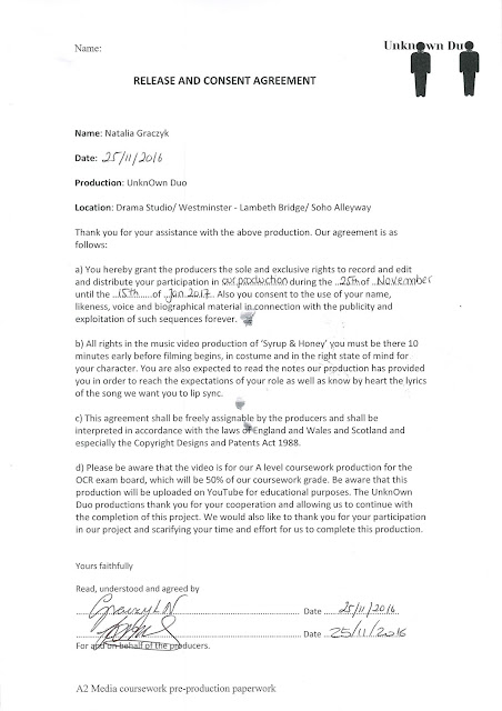
This form was created to help us when recruiting an actor, necessary for filming. It discusses the agreements that the person has to give their consent to when signing up to help us in our production. This form has to make the client aware of what is expected of them as well as acknowledge them of the possible risks and the future usage of the tape. This form needs to be distributed to everyone in the cast and in order to start filming they need to sign the form after reading and understanding all the terms and conditions of this contract. This is our example of the Client Release Form:


Advantages of creating the pre- production paperwork:

  • Allowed to make our production look legitimate
  • Helped to evaluate the possible risk that could occur
  • Allowed to prepare for these risks as well as how to deal with them
  • Given us legal security
  • Made us experience what it is like creating a production in the industry


Conclusion:

Overall, completing this task was highly beneficial because it has allowed to evaluate the possible risks that need to be taken under consideration as well as legally secure us in terms of a client and location which is important as now I know I can rely on the actors and know that I do not have to adjust my idea because everything went as planned.

Thursday 24 November 2016

Planning: Lighting and colour

Lighting helps to convey the character representation and mood of the music video as it is usually manipulated to create an effect on the audience and convey further meanings. Colour is the contrast that is evident the most in a scene. It also creates mood and makes different representation to get a specific audience response. Often lighting and colour complement one another and are used together to make a double effect on the spectator. These are important as subconsciously the audience always makes assumptions about the genre or character in the music video basing on lighting and colour. Without these the viewer will be confused on who they should support and who they should loathe.
Lighting is divided into two sections which include:

  • Angles- the positioning of the lights
  • Type -the way the lighting is used e.g.: dark or light


These are the different lighting and colour techniques we plan to use:

Top Lighting: We intend to use top lighting in our music video. This will be evident at the middle of our music video when the artist is in the alley way and stands under a street lamp and looks up to the light. The scene proposes prostitution however the holy connotations of top lighting contrast that thus giving away varied meanings for the audience who can find their own individualistic messages. This was inspired by Lana Del Rey’s music video Blue Jeans. In the video she uses top lighting to convey her innocent nature and purity of her love with another man.

Back Lighting: We also want to use back lighting in our production. This will be evident at the middle of our music video when the artist walks away from the lamp drinking and smoking and a long shot will capture their back as they walk towards the end of the alley way. We hope to create a silhouette of the artist in order to create suspense for the audience and keep them entertained. It also stands as a symbolic representation of hope for the character. This was inspired by Ed Sheeran’s video One where the artist stands in an empty auditorium and sings to help emphasize on his isolation and possible emotional issues. 

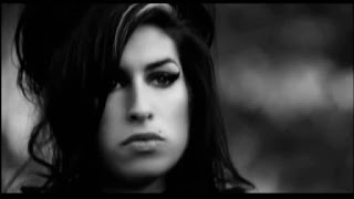
Black & White filter: The following music videos by Amy Winehouse - Back to Black, Lana Del Rey - Blue Jeans and Adele – Someone Like You, the use of black and white filter is effective in order to represent the sorrowful and miserable emotions of the artist and their feelings. It also enhances the narrative of the music video. This creates a mature feel for the audience which they can relate to and understand. These colours will also be used to portray our main artist in our music video as a disheartened person.  This will create a feeling of pity from the audience as the character looks lost and vulnerable. These neutral colours will be used throughout our music video, in order to represent the theme of addiction, consumerism and self-disruption of the character. The music videos have influenced our ideas as all of them connote are successful and appropriate to the genre.

Low key lighting/Natural: In our music video we will use natural lighting due to the time we are going to film the video in, therefore the natural/low key lighting will be beneficial as it will make our music video more generic and professional for the audience to watch. Not only it is conventional for the genre of our video, but also will help to portray our dark themes of self-disruption and alcohol addiction. This was influenced by the music videos stated above.


Conclusion:

In conclusion, the lighting and colour used in each of these music videos are effective in the way they are used and portrayed. As a result, we have also decided to use similar colours and lighting in order to ensure our video gives off a similar effect, having the same impact on the audience. It is important that we follow these videos as they are successful as a result of them using appropriate lighting and colour.

Planning: Editing

Editing is a technique which helps to assemble many images together to complete a sequence. Editing is an important part of a moving image because it helps to fluently move from one image top another. It is also used to set up the mood of the scene; allowing the audience to react in a certain way depending on the narrative. Editing can help to make and emphasis on the action by working with other micro-elements, such as sound. Some of the main editing techniques we plan to include in our music video are:

Slow jump cut: We plan to use slow jump cuts when the main character is walking in the alleyway. Jump cuts are not part of continuous editing techniques and will be recognised and stand out to the human eye. This will be used to represent the disruptive lifestyle of the artist as her behaviour is not healthy and will be recognised as unstable. This technique was influenced and developed from Amy Winehouse’s music video, ‘Back to Black’ where a shot is repeated twice from different angles. We believe that this shot will make our music video look professional and unique because is not an editing technique typically used in music videos.

Overlay: We plan to use an overlay in our music video towards the end when the artist lays on the ground and the shot is topped with an image of a ticking clock to show that her ‘time is running out’. This will create possible connotations of death which will make further suspense for the audience but can also engage them into the video more as they will try to guess what it means. We were inspired by Adele’s music video Send My Love which uses multiple overlay effects in order to enhance the visuals and show the concept behind the video. It was successful and gained mass popularity therefore we hope our technique will find an appeal.

Dissolve: We also plan to use a dissolve effect. This will be utilized at the end when the singer walks away from the camera and at last slowly disappears through the dissolve technique. This will leave the audience with apprehension as they are unaware of what happened to the artist and will be left to wonder. This was inspired by Ed Sheeran’s video Small Bump where the characters slowly appear and then dissolve to show passing time which matches Ed’s narrative. It is a unique and original technique therefore we hope that it will appeal to our audience as it’s less common.

Fade to black: We intend to use a fade to black technique at the end of our music video and after portray some text which will read ‘I AM not as FINE as I seem’. This will represent the emotional state of the main artist and possibly touch upon the theme of mental health and address the stigma surrounding it. This was influenced by Lana Del Rey music video ‘Blue Jeans’ where the scene ends with a fade to black shot. The shot looked professional and clean as the audience understand that the music video has ended. Similarly, in our music video we will finish the video with a fade to black leaving the text to allow the audience reflect on the quote.

Duplica: Another key editing technique we want to utilize in our music video is a duplica of our artist. This can confuse the audience as it’s an unusual edit and can be quite bizarre. However due to its originality it makes the music video interesting. This was inspired by Gondry’s diverse music video with Kylie Minogue Come into my World. We wanted to have an aspect of diversity in our video as the genre of our product is niche so we are able to experiment with unique editing styles.

Slow pace editing: We will use slow editing when the artist is performing to emphasise her importance, and to allow the audience to connect with her through her body language and facial expressions. It will also match the song’s pace and allow the audience to absorb the narrative and the concept behind the visuals. We were influenced by Adele’s music video ‘Someone like you’ which also uses slow editing throughout the video to reinforce the artist’s importance and role within the music video. This was edited in an effective manner, which is how we want to edit our scenes.  

Planning: Characters


Main Female Character/ Artist

Name: Natalia

Age: 17

Ethnicity: White, Eastern European

Gender Stereotype of Role: Show and express feelings as stereotypically women are much more emotional than males. In our video our artist will be emotional which is conventional but at the same time she will be mentally strong. Another common stereotype is that females don’t have addictions or don’t consume substances whereas males use them when having fun. However, we will challenge this in our video and show that females struggle with addictions too. This shows that she is not a conventional female artist.

Costume, Hair and Make-Up: We intend on using light make-up for our character in order to convey her class and wealth. It will imply that she is successful and therefore ‘should be happy’. In addition, we plan on using a black coat and boots to further emphasise her class. Additionally, we want our character to dress like a classy woman who is clearly financially stable and doesn’t lack money/ possessions etc. This will create a sense of superiority and intimidation from her and the audience will admire and aspire to be like her. The character will mainly wear dark clothing to convey her depressing thoughts and addiction of drugs. She will wear a winter coat, to show that she is longing for ‘warmth’ from others but also protection from the situation she is in. The main character will also wear a red lipstick and a light eye makeup to represent her as a femme fatal and someone you usually think is happy and ‘well off’ but when the makeup becomes smudged, it will represent her dark addiction of drugs and her vulnerability. Stereotypically having blond hair shows innocence and vulnerability, therefore we decided that the mains artist should be blonde to draw an audience response. 

Body Language and Facial Expression: She will lack a lot of face movements to create a sense of mystery. This is unlike pop where females will ‘lure’ the audience with their smiles or happy facial expressions. The character will have a straight face while singing which can also convey her miserable emotions. When it comes to her body language it complements the facials as the body movements will be also quite stiff and lack choreography. This will be used to further compliment the indie/blues genre and place the focus on the music instead of the artist.

Role Within the Music Video:  The character will take on the role of the female anti- hero and the artist. She will be the focus of the video and will play a key part in representing the narrative. She will be the one who walks around London and at the end will disappear.

Conclusion:


Overall, we believe that our character is appropriate for our music video because she fits the common conventions of an indie/ blues genre and audience will be able to identify with her which will help to build a relationship between the artist and the audience. Because the character is also our artist it will help us to establish her as a performer and possible help her to breakthrough in the industry. We are now clear on how we want to portray our character and we are hoping that this planning will be beneficial when it comes to creating our music video.

Wednesday 23 November 2016

Planning: Locations

Location is an important aspect to consider and plan when creating a music video as the setting is a main factor which determinates the success of a music video. The locations chosen in a music video must fit the concept and the narrative. My peer and I have decided on our locations after planning our storyboard and finalising our idea; ensuring that we considered all small aspects and had a clear idea of what our video will look like. We decided we wanted different locations to make our music video more mysterious, creating suspense and confusion for the audience but also add a variety and keep on entertaining the audience. Carrying out a questionnaire also helped us to finalise our decisions on our chosen locations, as we asked our audience "Where should the action be set?" Our target audience said they expected to see suburban areas, alleyways and Central London. As a result, we decided to follow what the audience wanted and also considered potential advantages and disadvantages of our chosen locations, as it is important to identify what problems could occur or how the locations could be adapted.


Conclusion:


Overall, we have decided to use various locations in order to make our music video more interesting. Certain locations we have chosen are conventional to the alternative Indie jazz/Blues genre, such as the suburban areas and Central London. All of our chosen locations are relevant to our narrative and our target audience, therefore we are hoping these locations will be beneficial and our scenes will be shot accordingly. However, we have also identified potential disadvantages and how to overcome them as this is important when planning, as we must ensure each location will be relevant and can be used and we need to be prepared for possible obstacles.

Tuesday 22 November 2016

Planning: Artist image

Genre ideas:

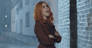
The genre of our music video is Indie Jazz/Blues, therefore, we intend to follow the main conventions as well as challenge some of them, by making our artist conventional to other jazz and blues artists, such as Lana Del Rey, Amy Winehouse and Paloma Faith who are artists that have an original style of performing. Similarly, our artist will also reflect originality, through our use of mise en scene. We will ensure that our artist looks confident and professional at first through her body language and facial expressions. Then through the use of make-up (that she will smudge) and the iconography of alcohol, we will portray her as a disheartened and sorrowful person which people struggling with addiction and emotional issues can relate to. However, we will also challenge stereotypes by allowing our artist to fulfill her self-disruptive longings through the song and themes, which is not evident in all Jazz and blues music videos, due to artists following conventions. By challenging genre conventions, we are likely to make the artist more successful and popular due to them becoming more noticeable by their fans, and the mainstream audience.

Morals and Values:

We want our artist to cause controversy in her morals because the Indie genre in well known to be controversial and left-wing in their representations. We want to attract our target audience through the true and original artist, which will show that they carry their own values and are not afraid to stand up for them, even if it makes them different form the mass. It is important that the artist is able to portray her own persona to match Dyer’s theory of ‘ordinary and extra-ordinary’, because then we will attract and appeal to everyday people. She should also be able to express her true self to the audience by being open about personal issues and addictions as people will be able to feel like they are not alone and can look up to celebrities that struggle.

Media perception:

Our artist is inspired by Amy Winehouse and Lana Del Rey. Both of these stars are respected within the industry and media. Therefore, she will be identified as a good performer in the industry rather than a fully established star. This is due to her lacking ultimate popularity and not being noticed by a mainstream audience. As a result, our artist will be perceived as niche, rather than mainstream, as she will express her different views and values which may be viewed as intense and sincere by certain audiences. Also, she will not be in the public eye as much as the mainstream artists, due to her being relatable to the audience though her normality and lack of consistent fame. Moreover, our artist will express her true self to the audience, rather than being portrayed as 'fake', which is important when it comes to the audience forming an opinion about an artist. Amy Winehouse and Lana Del Rey similarly expresses their true self to the audience through their unique image which is evident in the media, newspapers and magazines and are not afraid of the critique for their action as they have their loyal fan base.


Similar Artists:

  • Lana Del Rey
  • Paloma Faith
  • Amy Winehouse


These solo female artists have inspired us when constructing our own female performer. We want our artist to have a sophisticated look at first to assert her class. However, when the audience look closer they will be able to see a softer side to her, as if seeing different ‘layers’ to the artist and see her in various ways. This will help to add originality to the artist and get rid of monotony as the audience is always displayed to a different side of her and everyone will be able to identify with the performer.

In our production we want our artist to dress like a classy woman who is clearly financially stable and doesn’t lack money/ possessions etc. This will create a sense of superiority and intimidation from her and the audience will admire and aspire to be like her. However, during the music video, she will reject all that and show that she doesn’t truly care for her possessions but wants love and companionship. This challenges conventions as typically people long for wealth and success but she actively rejects that. This is typical of an indie/ blues artist as conventionally many niche artists often repel the mainstream values and chose to live by their own individualistic morals. Similarly, to the costume, the artist will also have a classy make up, consisting of light facial and eye highlights but red lips, similarly to Lana. However, during the video, she will smudge it away to imply her rejection of

typical beauty standards and convey that beauty doesn’t mean happiness, just like money. Both of these ideas are challenging the mass ideologies and therefore are conventional of the indie/ blues genre. Lastly the body language and the facial expressions we plan to use are similar to Amy Winehouse. In most of her music videos she has a very inert facial expressions and stiff body movements. This helps her to maintain her serious image but at the same convey her miserable persona, evident in most videos and her everyday life. We want our artist to have a similar facial features and body movements which matches the typical indie blues artists who have a common sorrowful image associated with them.


Our Artist:


In our production we plan to create an accurate image of a typical indie blues artist to fulfil audience expectations. We decided to use myself as the artist because we believe that I will be able to fulfil the role of an indie blues artist. I will take on the role of an unhappy woman who is longing for companionship. In order to reflect that she will have a miserable facial expression and a wretched body language. I will convey controversial values and challenge some mainstream conventions which will fit the indie/ blues genre. In addition, I look old enough to be the character we want to portray but at the same time I have a young look which will bring older and younger audiences together. Lastly I have experience in acting which will help me to convey the role of the main artist and portray a realistic character to the audience.


Link to Theory:

  • Hebdige: First off, audience engagement can be applied to our product. Engagement is linked to Hebdige theory. He stated that different people can react in different ways to the same stimuli, or a media product in this particular case. This can be linked to his subculture theory and how different groups of people react similarly within their group but differently to other groups, if exposed to the same media text. This means that audience has the power to engage in different media in their own individualistic way, based on their own memories or traits. This makes them an active consumer who can make their own choices and decisions. This is common for indie genre as such niche genre has a loyal fan base who actively selects to listen to such music as they are not fed with it from the media. Furthermore, the artist could be categorized into a subculture as she is clearly an individual who isn’t afraid to reject common values. For example, she rejects money and wealth for the sake of her own well being and emotional happiness.
  • Goodwin: Our idea will be associated with Goodwin's theory as we will follow the features he has identified which include: genre characteristics will be conveyed through the artist’s costume. The star will have their own individual image, with dark attributes from the makeup, and a mysterious persona from her body language and facial expressions.
  • Aristotle: The themes of youth, morality and consumerism are very common within today’s society and people will be able to identify with it. The theme of youth will evoke audience’s emotion as they will feel nostalgic about their own past, which will gain the artist a sympathetic response. The idea of morality will engage the audience as they will be able to judge the decisions the artist makes and actively respond to the product. Lastly the theme of consumerism is very applicable to today’s society. Clearly the artist is rejecting all her possessions and shows that products are not important and don’t give you happiness.
  • Dyer: Our artist will be portrayed as a performer as she will promote her moral ideologies throughout the music video. As suggested by Dyer ‘A star should be ordinary and extraordinary’, meaning that we will portray our artist as someone the audience will be able to relate to, for example her drug addiction and emotional issues, but extraordinary because she will be a talented singer.
  • Mulvey: We will not utilize Mulvey’s theory or ‘Male Gaze’ as the artist will not expose her attributes for heterosexual males and the camera will not linger around her assets. This is conventional for an indie/ blues music video because niche genres often promote equality and value the music instead of body selling.


Conclusion:


Planning our artist representation has been extremely beneficial for us, as we now have a clear idea of how we want our artist to be portrayed, which is to express her difficult situation. We are also now more aware of which similar artists we want our artist to reflect which is Lana Del Rey, Paloma Faith and Amy Winehouse who all differ from mainstream artists and can create controversy at times through their truthful and varying representation.  Now that we are aware of this, we will ensure our artist is portrayed in the correct way, making her niche but also mainstream, through media perception which will allow the audience to notice her and the fact that she has her own style of music and an original persona. Creating the right artist image is important in the long term as the audience should be able to identify the artist from the offset, identifying their beliefs, values and persona, which should not continuously change as it could turn the audience against the artist. Without planning our artist representation, we would not be able to link our artist to certain theories such as Goodwin and Hebdige who promote important factors within their theories, that should be evident within all music videos. Therefore, by planning our artist representation, we have now identified which characteristics our artist will follow and which theories will apply to her role.

Planning: Storyboard

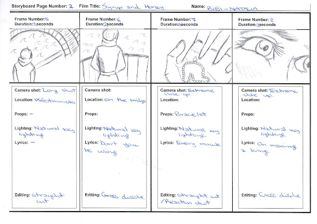
A storyboard is a series of shots which are put together in order to create a meaning to it. These are the pictures that together can tell a story. They are often used in the pre-production stages where the vision/ idea is placed onto paper and then can be developed with all the other members and used to film. These are great tools in pre- visualization when crating a moving image, because is the best way to share your own vision. It is also extremely easy and self-explanatory thus it doesn’t require much effort to present to others.

 Advantages of Storyboarding:
  •         Easy to create
  •          Helps to visualise the idea
  •          Easy to amend if needed
  •          Quick to Present
  •          Allows to plan ahead on all micro-elements
  •          Can be used during filming to know what to do
  •         Helps in organisation of ideas


Conclusion:


In conclusion, storyboarding was very beneficial and significant during the production making. This is because not only I was able to visualise the narrative but could compare my vision with my other half and we were able to see what shots would work best and which ones wouldn't be as effective. When creating this storyboard, we had to consider the different camera framing so we get the best from our shots, as well as could list the different aspects that would affect our shot such as lighting and colour or lyrics. Additionally, we will be able to use this storyboard and its descriptions during the editing stages as we have mentioned what transitions and edits we intend to use. This storyboarding task was vital because without this our planning wouldn't be completed and we would be unprepared to film as well as it has helped to make the idea come to life because of the visualisation of the narration. It also helped to see clearly what could be achieved and what would be harder to film which is necessary to think about, because we want to be prepared and realistic about our idea. 

Monday 21 November 2016

Planning: Research into similar videos

In order to gain a clearer understanding of the indie/ soul genre we have identified music videos and artists that are similar to the one we will try to create for our campaign. This allowed us to see what factors are crucial to consider when making own product and what did the successful videos do in order to achieve a profit. We looked at content and visual style, artist representation, and structure because these elements are that make up an artist and a music video.

Content and visual style

Inspired by:

  • Adele - Someone Like You
  • Ed Sheeran - A Team


When looking at the visual style and content of these videos my peer and I were particularly captured by the simplicity of the content and how effective it was. Both of these artists are globally successful despite their simple music videos. We identified key elements that influenced our music video and the overall campaign:

  • Setting: Adele uses an empty location next to a river where she performs the song. The setting is similar to the one we plan to use. In her video it is very effective as it makes the whole performance look like a reflection on Adele’s past and makes the audience reflect on themselves. This is one of the responses we plan to draw from our video and provoke the audience. Furthermore, Ed Sheeran uses the location of a busy city to emphasise on the character’s isolation which is something we plan to use in order to convey our character’s loneliness and helplessness.
  • Black and White Filter: Both videos use a black and white filter to create a serious atmosphere or address an issue. It helps to attract a mature audience, therefore my peer and I are planning to do the same in order to portray the important issue of addiction and self-disruption.
  • Character Representation: In both videos both characters seem troubled and alone. They show this through their troubling and regretful facial expressions and overall narrative/ concept of the video. They reflect on their past and clearly want a change. This is something our artist will represent. She will address the issue of troubled adults who, despite being financially stable, still struggle to feel fulfilled.
  • Editing: Both videos use predominantly slow paced editing which enables the audience to absorb the complex meanings behind the videos and match the slow song. We intend to do the same for our music video and allow the audience to create own meanings and understand the video at their own pace.
  • Themes: The theme of hope is very common in both videos. It is shown through the facial expressions and lyrics. This is similar to our idea as we plan to portray hopelessness though our character and her struggles.


Artist Representation

  • Paloma Faith- Only Love Can Hurt Like This
  • Lana Del Rey-  Young and Beautiful


While looking through different alternative female artist, we found Paloma Faith and Lana Del Rey particularly interesting in the way they represent themselves.  Despite being niche, both of these have their own original look and a loyal fan base. Lana Del Rey is known for her femme fatale or ‘dark’ look which she identifies with, similarly to Paloma who is classy yet familiar to the audience through her simple costume, hair and make-up.

Costume, Hair and Make-Up: Both singers have a light make up on their faces but highlighted lips to convey their sophisticated nature.  This helps to show their class but at the same time doesn’t glamourise them, unlike pop stars, because they manage to remain unique and original through their overall image. Their costume is not provocative which is conventional of indie female artist who don’t sell their music through nudity but the actual content of the song and sounds. We intend on using light make-up for our artist in order to convey her class and wealth. It will imply that she is successful and therefore ‘should be happy’. In addition, we plan on using a black coat and boots to further emphasise her class.

Body Language and Facial Expressions: Both of these artists have an inert facial expression. They lack a lot of face movements to create a sense of mystery. This is unlike pop where females will ‘lure’ the audience with their smiles or happy facial expressions. Both Lana and Paloma have straight faces while singing which can also convey their miserable emotions. When it comes to their body language it complements the facials as the body movements are also quite stiff and often lack choreography. This is used to further compliment the indie genre and place the focus on the music instead of the artist. In our music video we intend on using the same body language and facials in order to highlight the overall message and the music rather than use the artist as an attraction.

Other: Both artists seem somehow desolated which is often shown through their blank facial expressions and limited movement. When performing to the audience it is hard to pin point what they’re feeling exactly which allows the audience to interpret the video for themselves. This also helps to focus on the narrative more as the artist doesn’t bring attention to themselves which is conventional for a blues/ indie artist. In our music video we intend to make our artist seem blank due to her loneliness and lack of love which will link to the narrative and allow the audience to possibly identify with her feelings.


Structure and further artist representation:

  • Amy Winehouse – Back to Black
  • Amy Winehouse – Rehab


Whilst analysing these two music video, we were particularly interested in the structure and character representation as well as the narrative.

  • Performance from the characters: The main character in these two videos is the singer herself. In ‘Back to Black’ video Winehouse lip syncs throughout the music video as well as in ‘Rehab’. In both of the two music video Amy Winehouse perform a subtle narrative which complements the lyrics. However, the performance isn’t there to glamourize the artist but help build a connection or ‘introduce’ themselves to the audience.  We plan to do the same and have lip syncing in order to establish a relationship with the audience and build a connection.
  • Concept: In the music video ‘Back to Black’ the concept is quite original and interesting because the message is ‘when you've finished a relationship you go back to what's comfortable for you’ meaning that when Amy Winehouse broke up she started doing drugs. However, the message can be individualistic due to the content being very subtle and open for own interpretations which allows a mass audience to relate. Similarly, in ‘Rehab’ it is still unique and controversial because the meaning of the video is about not going to rehab, which is a true issue and addiction of the singer. However, the concept is again portrayed through subtle hints which makes it individualistic and relatable for the audience.  Our concepts will be portrayed in a subtle way too throughout our narrative, which will allow the audience to find their own meanings and understanding.
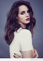
  • Narrative within the video: In ‘Back to Black’ the video is in black & white, then we see the artist singing while walking in a graveyard making the audience believe that someone close to the artist died. However, when we see the character burring a mystery box it makes the audience feel confused. This is an original narrative because it leaves the audience in suspense and yet again the narrative is simple enough and eerie for the audience to identify with and connect to. In ‘Rehab’, the narrative is simple as we see the character in different locations such as hospital, in a psychologist room and her house. This simple narrative allows the audience to find their own meanings and interpretations which makes it individualistic and familiar. We plan to have a simple narrative too as it will allow the viewer to find their own interpretation and therefore relate with the character which can help when building the connection between the artist and the viewer.


Character representation:

In each of the videos, the character is represented quite similar, however, the video ‘Back to Black’ has the theme of mystery where the character is shown as someone unhappy and miserable, whereas in ‘Rehab’ there is the theme of addiction where the artist is portrayed as someone rebellious. In both of the music videos the character is presented as someone the audience can relate to.
  • Back to Black: The character seems to wear black clothing connoting her sorrowful and depressing feelings.  Her facial expressions are serious and determinate, which shows her emotional and physical strength. The colour of the video is black and white connoting the good and bad times the singer has experienced. The make-up of the artist is quite heavy with bold eyeliner perhaps conveying her tears. The setting of a graveyard connotes death which also refers to the singer as she could feel really miserable after an occurrence in her life. The main iconography of this music video is a box, which is then buried, which leaves the audience questioning what was inside the box.
  • Rehab: In this music video the main character is presented as someone rebellious. Her facial expressions are determinate and carefree. She seems to be wearing everyday clothing thus connoting her miserable life of addiction. The setting changes from a house to a hospital to a therapy room where she expresses her addiction to drugs and alcohol.  Her make up is not as heavy as she used in Back to Black to show that she is not caring about her image too much due to her alcoholism and careless behaviour to life.


As a result, we will be using similar ideas, as we will also portray our character in a mysterious and unpredictable way, similar to the way these music videos do. We will do this through dark coloured costumes, upright postures and miserable facial expressions which connote innocence and unhappiness. This evokes compassion and pity from the audience as the character will disappear at the end of the video.